

Contents
Views (Design Presets) - Plugixa Testimonial
A View is a saved visual configuration - layout, colors, typography, spacing, pagination style, dark mode. Views control the look of a testimonial display; shortcodes control the behavior of an instance (see Views vs Shortcodes).
The plugin seeds 4 default views on activation:
| Slug | Name | Layout |
|---|---|---|
default-grid |
Default Grid | Grid |
default-slider |
Default Slider | Slider |
default-masonry |
Default Masonry | Masonry |
default-list |
Default List | List |
Pro users can create unlimited views. Free users are capped at 2 views - the Add View button converts to an Upgrade CTA when the limit is reached.
The view list
Go to Plugixa Testimonial → Views.
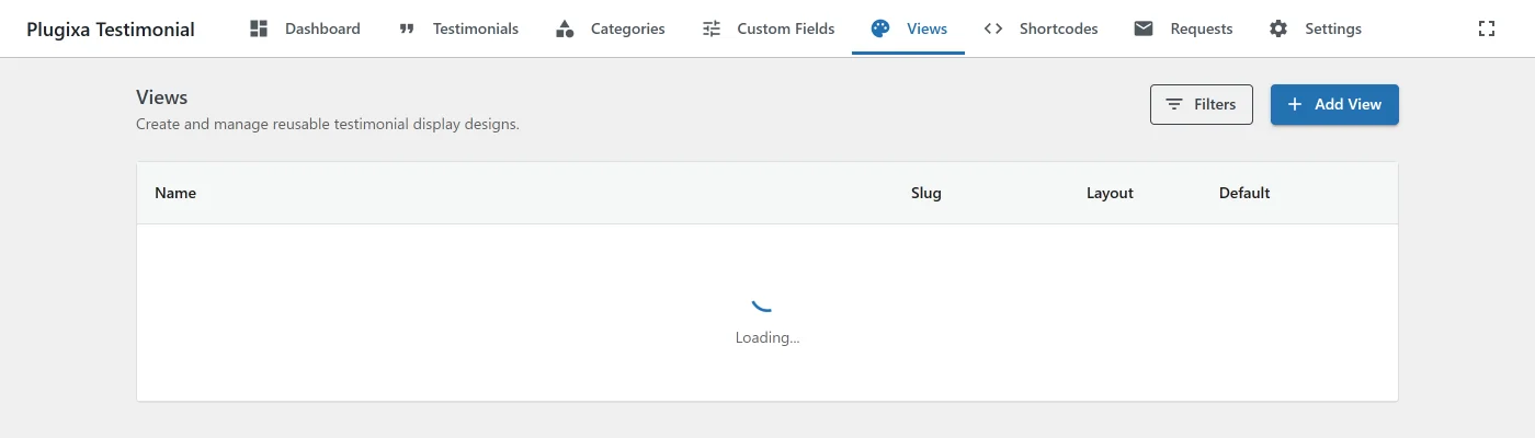
For each view you see: name, slug, layout type, default badge (★), last modified, an inline star toggle to set the default.
Actions on each row:
- Edit - open the view editor.
- Duplicate - clone with a new slug. Useful as a starting point for a variant.
- Set as default - inline star click (optimistic update).
- Delete - remove (non-default views only).
Creating a view
Click Add New View. A blank view form opens.
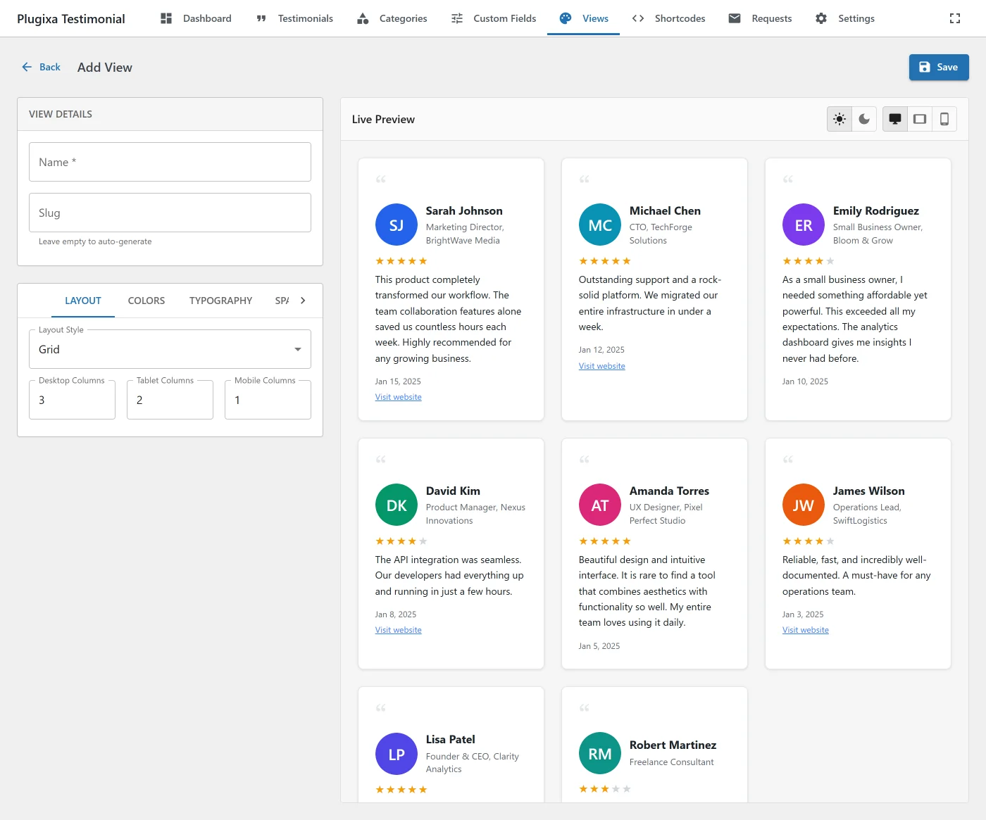
Give the view a name and slug, pick a layout, then configure each tab.
Layout types
| Layout | Description |
|---|---|
| Grid | Responsive card grid. You control columns per breakpoint. Best for uniform content lengths. |
| Slider | Horizontal carousel (Swiper 11.x) with 7 effects. Supports multi-row grids. |
| Masonry | Pinterest-style variable-height cards using CSS columns. |
| List | Vertical full-width list. Ideal for long-form testimonials. |
View configuration
Views are stored as JSON in the config column of wp_plugixatestimonial_views. The 7 tabs below map directly to keys in that JSON.
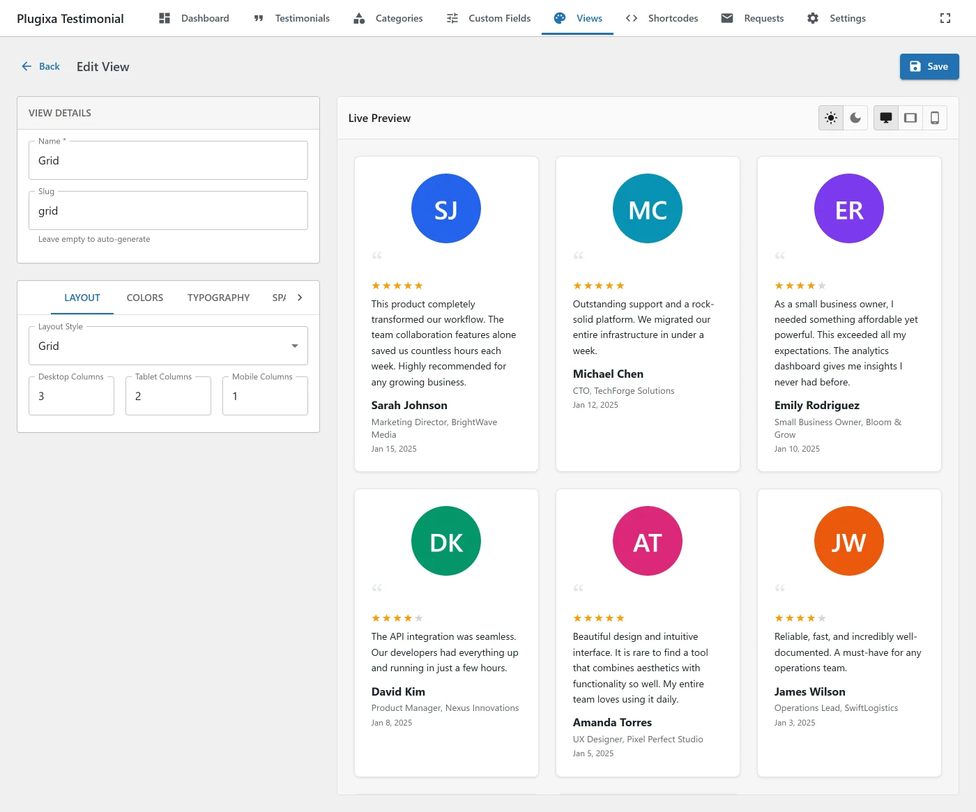
Layout tab
| Setting | Values | Notes |
|---|---|---|
| Style | grid, slider, masonry, list |
The root layout. |
| Columns | desktop, tablet, mobile (int) |
Grid + Masonry columns per breakpoint. |
| Slides per view | desktop, tablet, mobile (int) |
Slider only. |
| Rows | desktop, tablet, mobile (int) |
Multi-row slider - disables loop when > 1. |
| Gap | px | Space between cards. |
| Autoplay / speed / delay / pause-on-hover | Slider only. | |
| Effect | slide, fade, cube, coverflow, flip, cards, creative |
Swiper effect. Single-slide effects (fade/cube/flip/cards/creative) force slidesPerView: 1. |
| Loop | boolean | Disabled automatically when slides ≤ slidesPerView or rows > 1. |
| Arrows / Dots / Pagination type | bullets, fraction, progressbar |
Slider pagination. |
| Direction / Keyboard / Mousewheel | Slider keyboard & direction. |
Colors tab
Separate color sets for light mode and dark mode - toggle between them in the preview toolbar.
| Key | Role |
|---|---|
cardBg / containerBg |
Card and container backgrounds. |
textColor |
Body text (testimonial content). |
nameColor |
Client name. |
roleColor |
Role / company. |
starColor / starEmptyColor |
Filled and empty rating stars. |
borderColor |
Card border. |
quoteColor |
Decorative quote icon. |
Plus a separate colors section for category navigation - normal state, active state, description box.
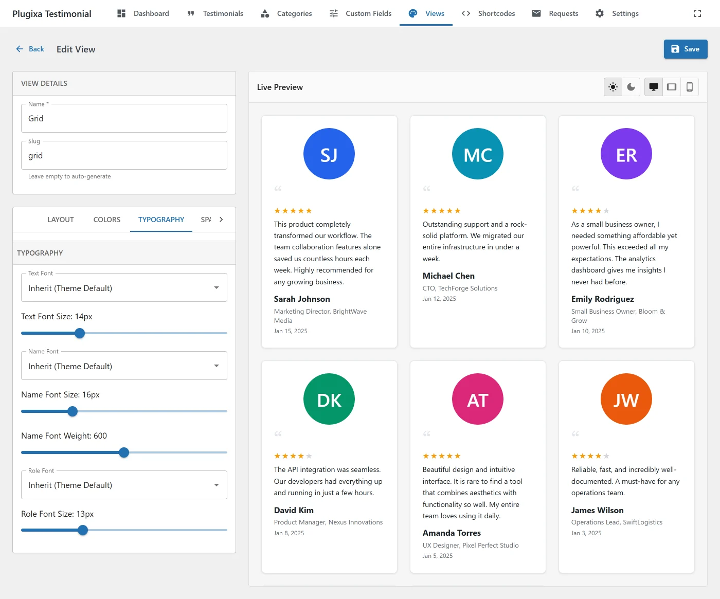
Typography tab
Font family, size, weight - configured separately for testimonial text, name, and role.
The font picker lists:
- Web-safe system fonts (Arial, Georgia, Helvetica, etc.).
- Google Fonts - lazy-loaded on first open, grouped by category (sans-serif / serif / display / handwriting / monospace), live preview.
Google Fonts require an API key in Settings → General → Google Fonts API Key. The plugin caches the font list in a 7-day transient and injects <link> tags on the frontend only when a Google font is used.
Spacing tab
- Card padding (px)
- Card gap (px)
Photo tab
| Setting | Values |
|---|---|
| Size | Number + unit (px, %, rem). |
| Border radius | Percent - 50% = perfect circle. |
| Border width / style / color | CSS border shorthand. |
| Shadow | CSS box-shadow. |
| Opacity | 0–100. |
| Grayscale filter | boolean. |
| Hover scale | multiplier (e.g. 1.05). |
| Fallback bg / text color | For initials/icon fallback. |
Categories tab
Configure the frontend category navigation:
- Display style -
none,tabs,pills,dropdown,sidebar. - Show category description - boolean.
- Colors / typography / spacing / border - full styling controls.
See Categories → Category navigation.
Pagination tab
Pagination styling (hidden for slider layouts):
| Style | Description |
|---|---|
numbers |
Traditional numbered pagination links. |
load_more |
“Load More” button, AJAX append. |
infinite_scroll |
Auto-load on scroll. |
Full color, border, and hover styling for each style’s buttons.
Dark mode
Every view has a darkMode config with its own color set and an enabled toggle. In the preview toolbar, a Light/Dark ToggleButtonGroup switches which color set is being edited and previewed.
Shortcodes can override the view’s dark-mode behavior:
Shortcode dark_mode |
Effect |
|---|---|
disabled (default) |
Light mode. |
enabled |
Force dark mode. |
auto |
Follow prefers-color-scheme. |
Live preview
The right pane of the view editor renders your current view config with 12 sample testimonials. Updates are instant - no save needed.
The preview supports:
- Light / Dark toolbar - switches the color set being edited and the preview background.
- Viewport switcher - Desktop (100%), Tablet (768px), Mobile (375px) - controlled via MUI
ToggleButtonGroupwith device icons. - Real data - in ShortcodeForm, the preview fetches actual approved testimonials matching the shortcode’s filters; falls back to sample testimonials if no matches.
Using a view
In a shortcode:
[plugixa_testimonials view_id="3"]
[plugixa_testimonials]                      <!-- uses the default view -->
In a Gutenberg block, pick it from the View dropdown in the block sidebar.
In an Elementor widget, pick it from the View control.
Setting the default
Any shortcode without a view_id attribute uses the default view. Change the default from the list - click the star icon next to a view for inline toggle (optimistic update), or use the Set as Default action menu.
Views vs Shortcodes
Because it’s easy to confuse the two:
| Views | Shortcodes | |
|---|---|---|
| Controls | Visual appearance | Content selection and display toggles |
| Examples | Colors, fonts, layout, pagination style | Category filter, featured-only, show_photo, show_rating, dark-mode override |
| Scope | Reusable across many shortcodes | Per-instance on a page |
| Storage | wp_plugixatestimonial_views |
wp_plugixatestimonial_shortcodes (saved configs) |
Rule of thumb: if it’d be weird for two instances on the same page to differ, it belongs to the view. If it’s instance-specific (showing or hiding photos, different category filter, different limit), it belongs to the shortcode.
Important: “which fields to show” (photo, rating, role, company, date, website, quote icon, video, custom fields) has moved from Views to Shortcodes. Views now control visual design only.
REST API
| Method | Endpoint | Description |
|---|---|---|
GET |
/wp-json/plugixatestimonial/v1/views |
List with pagination + filters (search, is_default, layout_style). |
POST |
/wp-json/plugixatestimonial/v1/views |
Create. Enforces free views limit (2) - returns 403 views_limit_reached with upgrade_url on free installs at the limit. |
GET |
/wp-json/plugixatestimonial/v1/views/{id} |
Get by ID. |
PUT |
/wp-json/plugixatestimonial/v1/views/{id} |
Update. |
DELETE |
/wp-json/plugixatestimonial/v1/views/{id} |
Delete. |
DELETE |
/wp-json/plugixatestimonial/v1/views/bulk |
Bulk delete. |
POST |
/wp-json/plugixatestimonial/v1/views/{id}/duplicate |
Clone. |
POST |
/wp-json/plugixatestimonial/v1/views/{id}/set-default |
Make default. |
GET |
/wp-json/plugixatestimonial/v1/views/default-config |
Baseline config as a starting point. |
Separate endpoint for Google Fonts:
| Method | Endpoint | Description |
|---|---|---|
GET |
/wp-json/plugixatestimonial/v1/google-fonts |
Proxy to Google Fonts API with 7-day transient cache. |
Related
- Shortcodes
- Blocks
- Categories - category navigation inside views
- Free vs Pro - free views limit