

Contents
Styles - Plugixa Easy Social Share Buttons
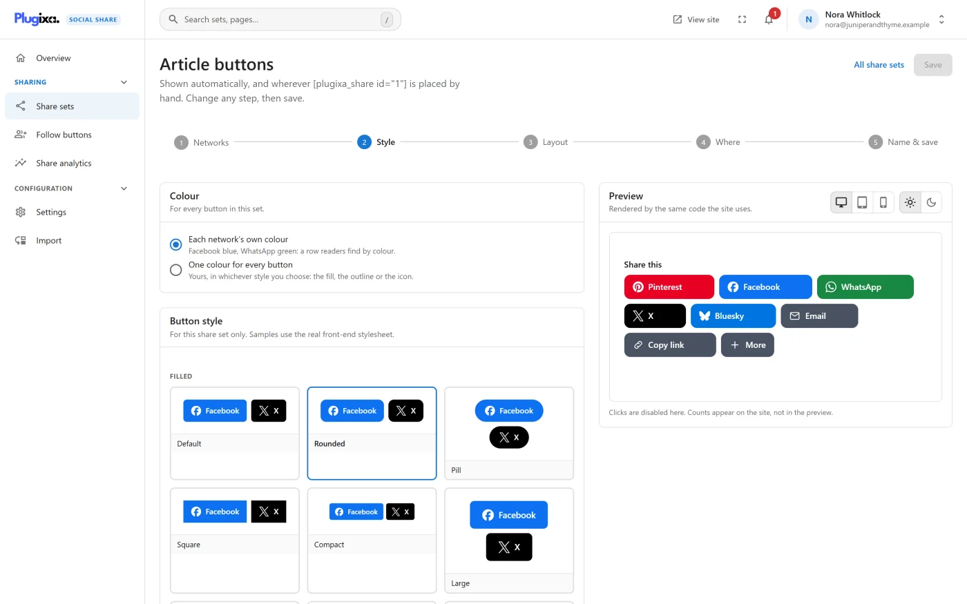
A style decides how a share set’s buttons are drawn. Each share set has its own style, colour, layout and size, chosen in the wizard’s Style and Layout steps. Follow buttons use the same styles.
The free styles
The gallery files the styles under five headings. The slug is what the
shortcode’s template attribute uses.
Filled
Buttons filled with the network’s colour. What most sites use.
| Style | Slug |
|---|---|
| Default | default |
| Rounded | rounded |
| Pill | pill |
| Square | square |
| Compact | compact |
| Large | large |
| Bold | bold |
| Glow | glow |
| Circle | circle |
| Tile | tile |
Outlined
The colour is on the edge and the label, not behind it.
| Style | Slug |
|---|---|
| Outline | outline |
| Outline pill | outline_pill |
| Outline square | outline_square |
| Outline circle | outline_circle |
| Hairline | hairline |
Light
| Style | Slug |
|---|---|
| Light | light |
| Light pill | light_pill |
| Card | card |
| Tinted | tinted |
Neutral
These styles use their own colours and ignore each network’s.
| Style | Slug |
|---|---|
| Dark | dark |
| Grey | grey |
| Grey circle | grey_circle |
| Dark outline | dark_outline |
Text only
| Style | Slug |
|---|---|
| Minimal | minimal |
| Underline | underline |
| Small caps | caps |
| Bare | bare |
That is 27 styles in the free edition.
The Pro styles PRO
Pro adds a sixth heading, Distinctive, with six more styles: split icon chips, lollipops, leaves, a retro card and a joined row.
| Style | Slug |
|---|---|
| Classic | classic |
| Classic round | classic_round |
| Lollipop | lollipop |
| Leaf | leaf |
| Retro | retro |
| Joined | joined |
They appear in the same gallery, with the same live preview and readability check, after the free groups. No extra stylesheet is loaded for them: a style is a handful of values applied to the same small stylesheet every style uses.
Colour
The Colour panel applies to every button in the set.
| Choice | What it does |
|---|---|
| Each network’s own colour | Facebook blue, WhatsApp green: a row readers find by colour. The default. |
| One colour for every button | Your colour, in whichever style you choose: the fill, the outline or the icon. |
With one colour, type or pick a Button colour as six hex digits, like
#0a66c2. The label on it is drawn white or near-black, whichever reads, and
the panel says which was chosen. Tick Choose the label colour myself to set
a Label colour of your own.
A Neutral style paints its own colours, so your colour shows only where that style would show a network’s, if anywhere. The Filled, Outlined, Light and Distinctive styles use it throughout.
For one place only, the shortcode can override the colour:
[plugixa_share color="#0a66c2"]. color="brand" gives a coloured set its
networks’ colours back in that place. See
Shortcodes.
Exact brand colours
Some brand colours are too light for a white label. By default the plugin draws those a shade darker, just enough to read. Settings -> Appearance -> Use exact brand colours switches that off for the whole site, so every button uses the network’s published colour. The Style step then shows which networks fall short.
The readability check
The Readability panel measures the colours actually drawn, against the layout you chose.
| Layout | What is needed |
|---|---|
| Buttons that show a label | A contrast of 4.5:1 |
| Icon-only buttons | A contrast of 3:1 |
- Where a brand colour is fine behind an icon but too light behind a label, the panel says so and suggests the icon-only layout, or an outlined or text-only style.
- A colour of your own is measured where the style draws it: behind the label, or on the page. If it fails, the panel says whether to pick a darker or lighter colour or to let the label colour be chosen for you.
- A Neutral style reports that brand contrast does not apply.
Layout and size
These are set in the Layout step.
| Option | Choices |
|---|---|
| Button layout | Icon and name, Icon only, Icon above name |
| Size, Desktop | XS, S, M, L, XL, XXL |
| Size, Mobile | Same, or XS to XXL |
| Alignment | Left, Centre, Right, Fill the width |
Size multiplies the style’s own proportions: height, padding, label, icon and gap together. M is the style as designed.
| Size | Scale |
|---|---|
| XS | 0.75 |
| S | 0.875 |
| M | 1 |
| L | 1.15 |
| XL | 1.3 |
| XXL | 1.5 |
With an icon-only layout the network’s name stays in the page as hidden text, so screen readers still announce “Share on” and the network.
What to do next
- See every wizard step in Share sets.
- Match your profile links to your share row in Follow buttons.
- Add a style of your own with the
plugixa_social_share_templatesfilter: Hooks reference.