

Contents
Builder: Design - Plugixa Chat
The second step of the builder asks “How should it look?”. Every change is shown at once in the live preview.
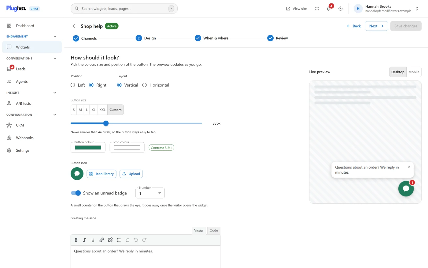
The live preview
The preview draws the real widget with your settings. The Desktop and Mobile switch above it changes the width it is drawn at. On the Channels step the preview keeps the widget open; on the other steps it behaves as it will on your site.
Main options
| Option | Choices | Default |
|---|---|---|
| Position | Left or Right. The corner of the screen the launcher sits in | Right |
| Layout | Vertical: channels stack above the launcher, each with its label. Horizontal: channels sit in a row beside the launcher, as icons without labels | Vertical |
| Button size | S, M, L, XL, XXL or Custom | M |
| Button colour | The launcher’s background | #0f766e |
| Icon colour | The colour of the icon on the launcher | #ffffff |
| Button icon | The launcher’s icon. See Button icon | A speech bubble |
| Show an unread badge | A small number on the launcher. See Unread badge | Off |
| Greeting message | A message bubble beside the launcher. See Greeting message | Empty |
Button size
| Preset | Size |
|---|---|
| S | 44 pixels |
| M | 56 pixels |
| L | 68 pixels |
| XL | 80 pixels |
| XXL | 96 pixels |
| Custom | A slider from 44 to 96 pixels |
The note under the control reads “Never smaller than 44 pixels, so the button stays easy to tap.” A size outside 44 to 96 is brought back into that range when the widget is saved.
Colours and contrast
Beside the two colour fields a badge shows Contrast and the ratio between the button colour and the icon colour, for example 5.2:1. When the ratio is below 4.5:1 the badge warns “This combination is hard to read. Aim for 4.5:1 or better.” and the Review step lists “The icon is hard to see against the button colour.” It is a warning, not a refusal: you can still publish.
Button icon
| Button | What it does |
|---|---|
| Icon library | Opens the searchable library, with Icons and Brands tabs |
| Upload | Chooses an image from the media library |
| Use default | Goes back to the speech bubble |
Unread badge
Switching on Show an unread badge puts a small counter on the launcher. Number sets what it shows, from 1 to 9.
“A small counter on the button that draws the eye. It goes away once the visitor opens the widget.” Once a visitor has opened the widget, their browser remembers it and the badge is not shown to them again.
Greeting message
A short message shown in a bubble beside the launcher, such as “Need help? Chat with us”. The field is a small editor: you can use bold, italics, underline, lists, line breaks and links. The message can be up to 2000 characters, and can contain the merge tags listed in the Channels catalogue.
The bubble has a close button. It also goes away when the visitor opens the widget. A greeting with no text in it is not shown.
More options
More options opens five further settings. Fewer options folds them away. The section opens by itself when one of them has been changed.
| Option | Choices | Default |
|---|---|---|
| Side spacing | The gap between the launcher and the side of the screen, 0 to 400 pixels | 24 |
| Bottom spacing | The gap between the launcher and the bottom of the screen, 0 to 400 pixels | 24 |
| Attention effect | A repeating movement on the launcher. See below | None |
| Opens on | What opens the list of channels. See below | Click |
| Button label for screen readers | Describes what the button does. Leave blank to use the default, “Open chat options” | Empty |
Attention effect
| Effect | Effect | Effect |
|---|---|---|
| None | Bounce | Pulse |
| Shake | Spin | Fade |
| Float | Sheen | Blink |
| Wobble |
“Turned off automatically for visitors who ask for reduced motion.” A visitor whose device is set to reduce motion sees a still launcher whatever you choose here.
Opens on
| Choice | Behaviour |
|---|---|
| Click | The list opens when the visitor presses the launcher |
| Hover | The list also opens when the pointer moves onto the widget, and closes when it leaves |
| Always open | The list is open as soon as the widget appears |
Pressing the launcher always works, whatever is chosen, so the widget stays usable by keyboard and on touch screens.
Channel colours and icons
Each channel’s colour and icon are set on its own card in Builder: Channels, not on this step.
What to do next
- Decide when and where the widget appears in Builder: When and where.
- Read how the widget behaves for keyboard and screen reader users in Accessibility and performance.