

Contents
Views - Plugixa Recipe
A View is a reusable design preset. It bundles a layout (grid / slider / masonry / list), colors, typography, spacing, image options, category bar, and pagination styling into a single saved record that any shortcode or block can reference.
Create one view for the home page (“Featured, 4-column grid, large images”), another for a sidebar (“Compact list, no images”), and swap them at will without touching the page content.
The views list
Navigate to Recipes → Views.
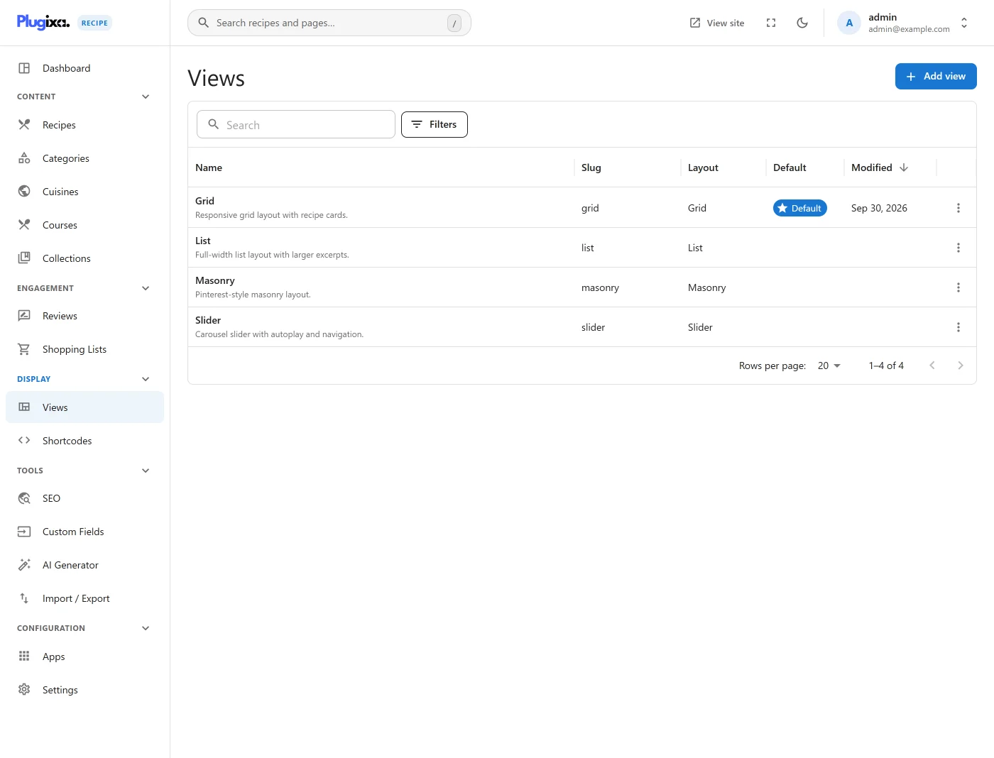
Each row shows the name, slug, layout style, and whether it is the default view (used when a shortcode doesn’t specify one). You can duplicate a view as a starting point for a new one.
The view editor
Click a view to open the editor.
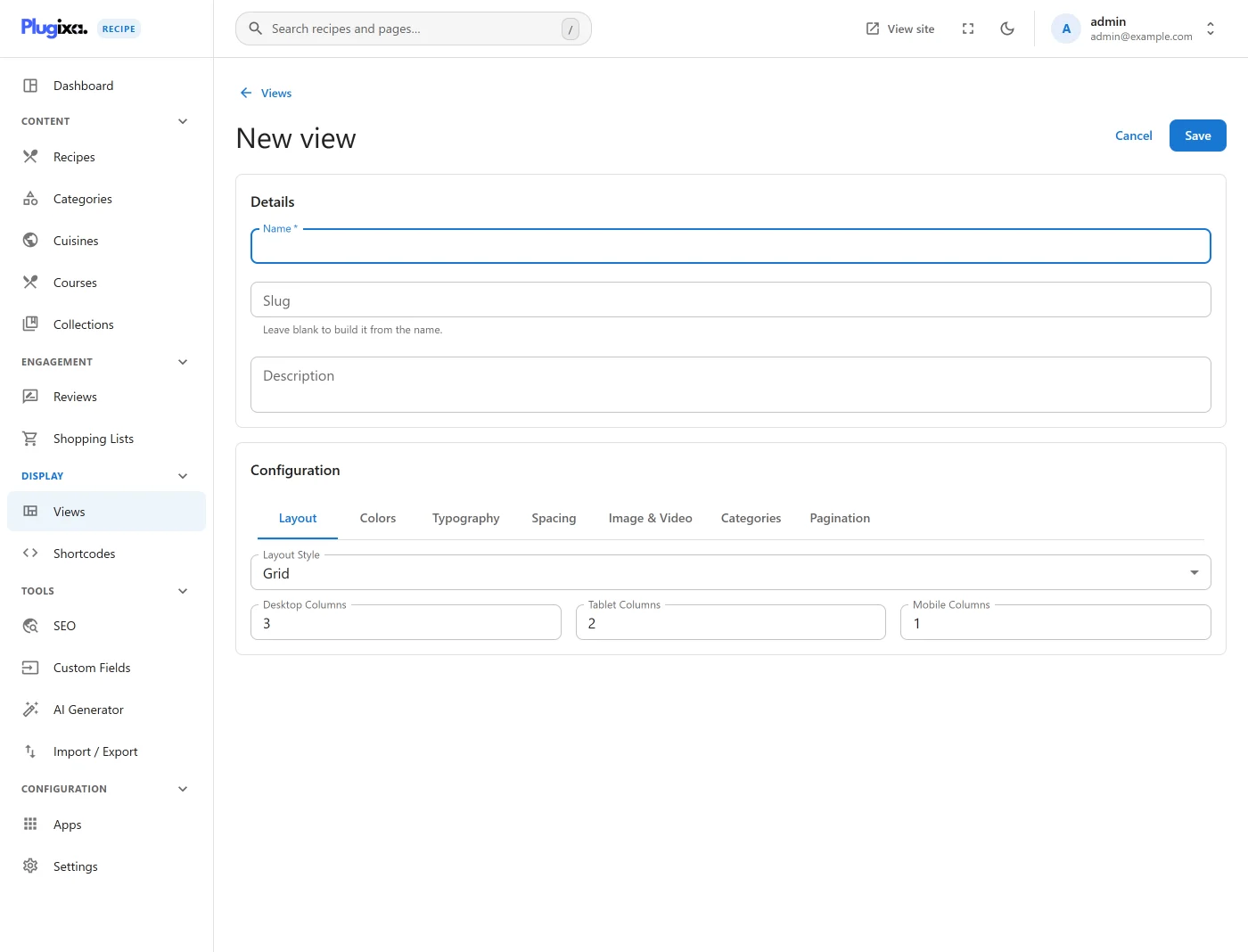
The form is organized into 6 tabs:
| Tab | Configures |
|---|---|
| Layout | Style, columns, slider behavior, pagination |
| Colors | Light mode, dark mode |
| Typography | Font families, sizes, weights |
| Spacing | Gap, padding, borders, shadows |
| Image & Video | Image size, aspect ratio, border radius, video preview |
| Categories | Category filter bar - style, colors, typography |
Tab 1 · Layout
- Layout style:
grid,slider,masonry,list- drives which template (templates/{style}.php) is used. - Columns: separate values for desktop / tablet / mobile.
- Slider options (when style = slider): slidesPerView, autoplay, autoplay speed, effect (slide / fade / cube / flip), loop, grabCursor, pauseOnHover, keyboard, mousewheel, paginationType (bullets / fraction / progress).
- Pagination: on/off, style (numbers / load more / infinite scroll), per-page count.
Tab 2 · Colors
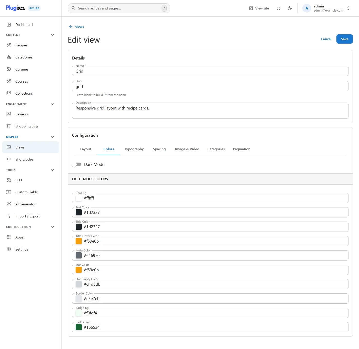
Each color field uses the mui-color-input picker (swatch + hex input). Separate palettes for:
- Light mode - card background, title, text, meta, border, badge, star colors.
- Dark mode - same palette, applied when
dark_mode="true"on the shortcode or via a CSS variable.
See the --pxr-* CSS custom properties in assets/frontend/src/custom.css - every color becomes a variable on the container.
Tab 3 · Typography
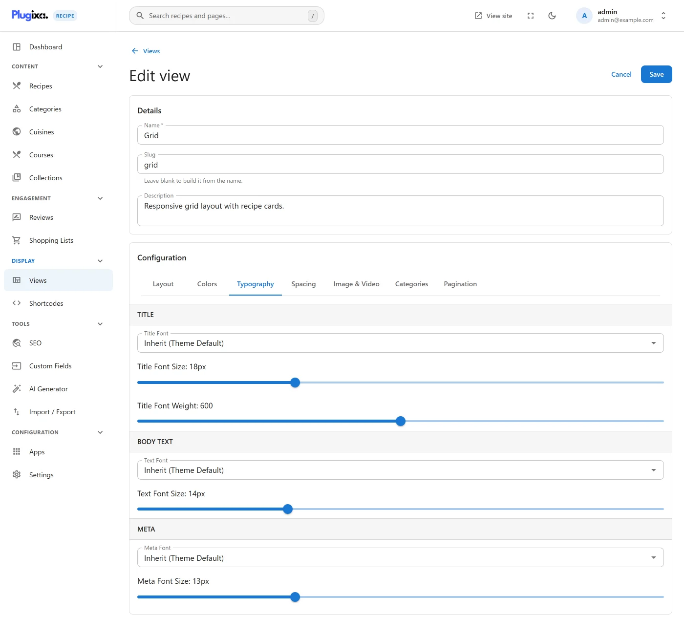
- Title font size / weight / family (Google Fonts picker - see the
GoogleFontPickercomponent). - Text font size / family.
- Meta font size / family.
When you pick a Google Font, the plugin registers it for enqueue on pages where the shortcode/block is present.
Tab 4 · Spacing
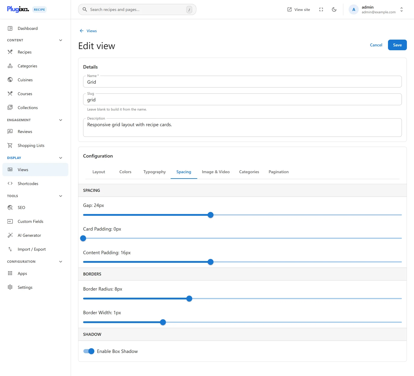
- Gap between cards
- Card padding
- Content padding
- Border radius
- Border width
- Shadow preset (none / sm / md / lg / xl)
Tab 5 · Image & Video
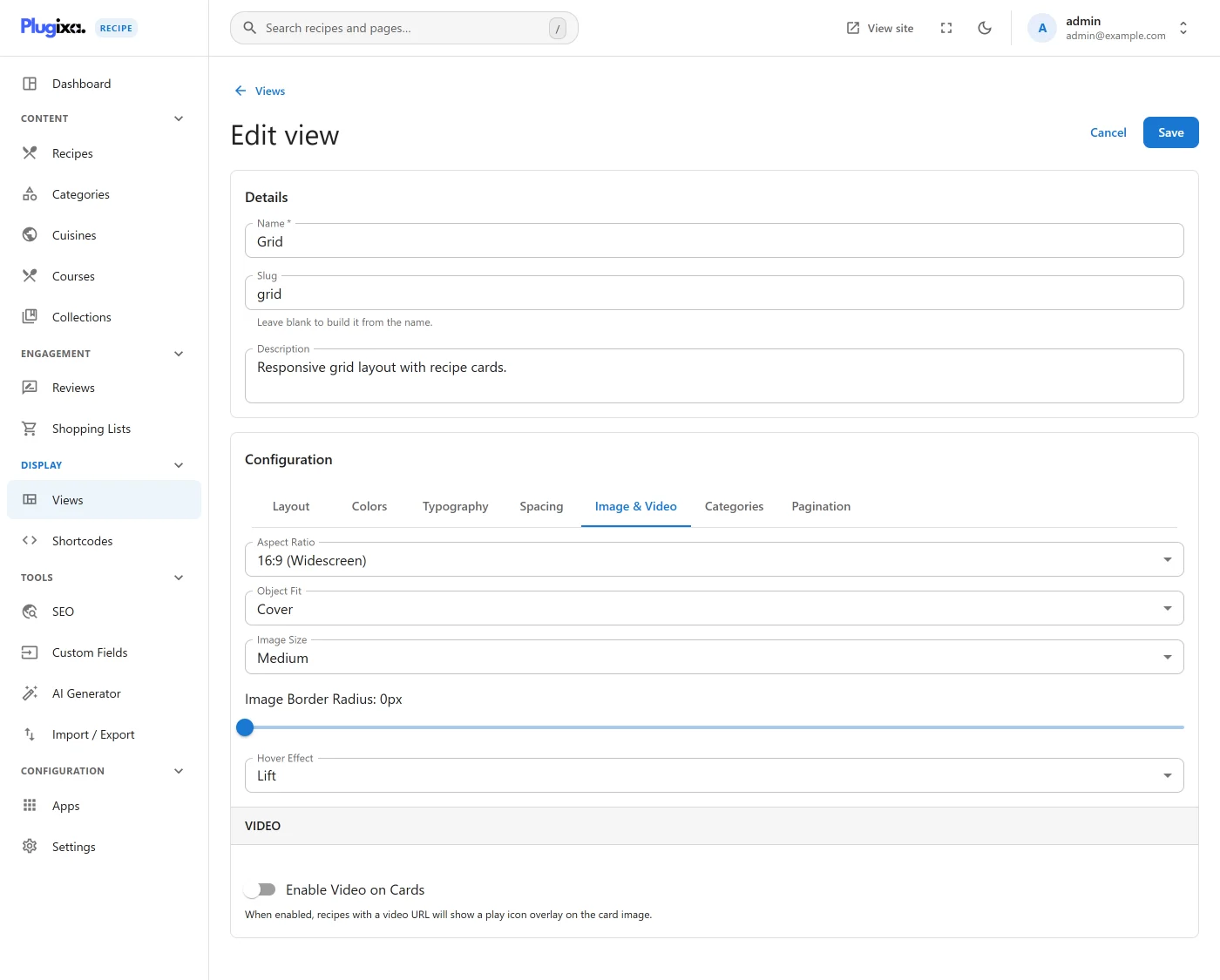
- Image size: any registered WordPress size (thumbnail, medium, medium_large, large, full, or custom).
- Aspect ratio: free / 1:1 / 4:3 / 16:9 / 3:4 / custom.
- Border radius for images.
- Object fit: cover / contain.
- Video preview on hover toggle: embeds the recipe’s video URL on card hover.
Tab 6 · Categories
Configure the category filter bar that appears above the grid:
- Style: none / tabs / pills / dropdown.
- Colors (background, text, active background, active text, border) - with dark-mode overrides.
- Typography (font size, weight, family).
- Spacing (gap, padding).
- Border (radius, width, color).
Saving a view
There is no preview inside the view editor. The Configuration tabs are settings, and you see the result on the page rather than beside the form.
What you do get is immediacy on save: a view applies everywhere it is used as soon as it is saved, with no cache to purge. The quickest way to judge a change is to keep a page that uses the view open in a second tab and reload it after saving. To try a design before it is live, point a draft page at the view with a shortcode and preview that page.
Assigning a view
In shortcodes
[plugixa_recipe view="featured-grid"]
[plugixa_recipe id="7"] - loads the saved shortcode's view
In blocks
The Plugixa Recipe block sidebar has a View dropdown. Pick any saved view.
Default view
One view can be marked default. It’s used when a shortcode/block doesn’t specify a view. Flip the is_default toggle on the view form.
Custom CSS per view
Each view has a customCss config key. Styles you put there are scoped to #plugixa-recipe-root instances using this view - a quick way to add theme-specific tweaks without touching global CSS.
Duplicating views
Use the Duplicate action on the list to clone a view. The copy gets “(Copy)” appended to the name; the slug gets -copy appended.