

Contents
On this page
The group editor - Plugixa Extra Product Options
The group editor is where you build a group’s fields. Open it by clicking a group’s name in the list, or with New group.
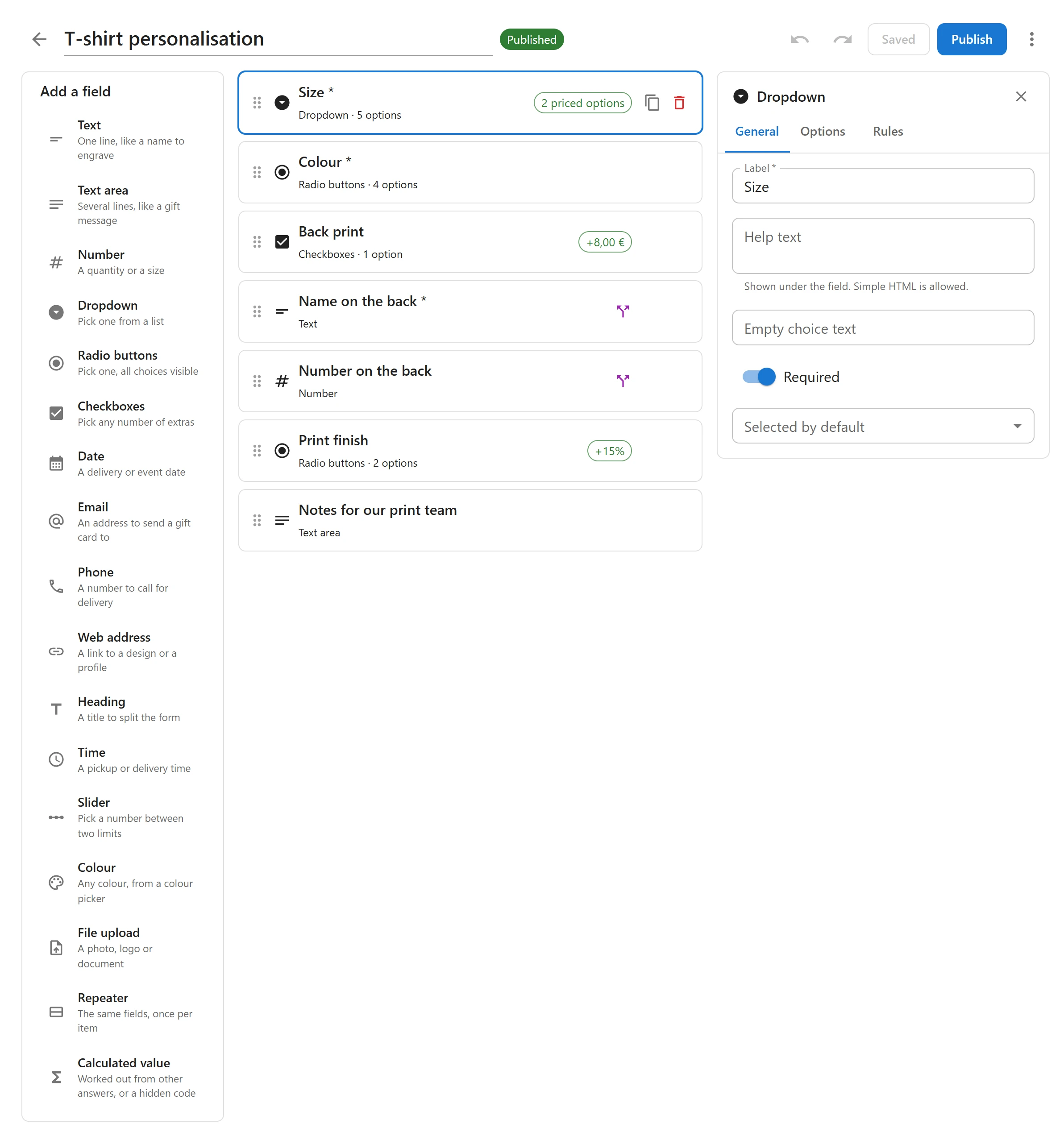
The layout
| Area | What it holds |
|---|---|
| Top bar | The group’s name (click to rename it), Undo and Redo, Save draft, Publish and More actions |
| Left column | Add a field: the field types. Click one to add it at the end of the form. |
| Middle column | The fields of the group, in the order customers see them |
| Right column | The settings of the selected field, or the group’s own settings when no field is selected |
Each field in the middle column shows its label, its type, how many choices it has and how many of them are priced, and a Shown or hidden by rules mark when a rule controls it. Click a field to select it.
The Full screen button in the admin bar hides the WordPress menu, which gives a long group more room. Click Exit full screen to go back.
Adding and arranging fields
- Add: click a type under Add a field. The new field is added at the end and selected.
- Reorder: drag a field by its handle (Drag to reorder) to a new place.
- Duplicate: click Duplicate on a field to copy it, choices, prices and rules included.
- Delete: click Delete on a field. Undo brings it back.
Field settings
The selected field’s settings are split into tabs. Which tabs show depends on the field type.
General
| Setting | What it does |
|---|---|
| Label | The field’s name on the product page, in the cart and on the order. A Heading field has Heading text instead. |
| Help text | Shown under the field. Simple HTML is allowed, such as bold text or a link. |
| Placeholder | Grey sample text inside an empty text, number, email, phone or address box. For a dropdown, Empty choice text replaces “Choose an option”. |
| Customers must fill this in | Makes the field required. The customer cannot add the product to the cart without it. |
| Default value | Filled in when the page opens. For radio buttons and dropdowns, Selected by default picks a choice. |
| Minimum / Maximum | For a number: the smallest and largest value accepted. |
| Min. choices / Max. choices | For checkboxes: how many choices the customer must and may tick. |
| Max. characters | For text and text area fields: the longest answer accepted. |
| Pricing | For fields without choices: what filling the field in costs. See Pricing. |
Options
For dropdowns, radio buttons and checkboxes. Each choice has a label and a price. Use Add option to add a choice, the arrows to move one up or down, and Remove option to delete it. The first two choices of a new field are called Option 1 and Option 2: rename them.
Rules
Show or hide the field depending on the answer to another field. See Show/hide rules. A Heading field has no rules tab.
The group’s settings
Close the selected field with the Close button at the top of its settings, and the right column shows the group’s own settings:
- Where it shows: the products and categories the group appears on. See Where groups show.
- Order: when several groups show on one product, lower numbers come first.
Undo and redo
Every change can be undone with Undo or Ctrl+Z, and redone with Redo or Ctrl+Shift+Z, as long as the editor is open, up to the last 100 changes. The history covers fields, choices, prices, rules and the group’s settings.
Saving and publishing
Save draft keeps your work without showing it to customers. The button reads Saved when there is nothing new to save. Publish checks the group, then makes the current draft live. See Option groups for the statuses and the checks.
If you try to leave the editor with unsaved changes, your browser asks you to confirm.
Quick Links
Share