

Contents
On this page
Swatches and buttons - Plugixa Extra Product Options
Radio buttons and checkboxes can show as colour swatches, image swatches or buttons instead of a plain list. A mug in six colours, a choice of wood finishes, sizes as buttons: customers see the choice instead of reading it.
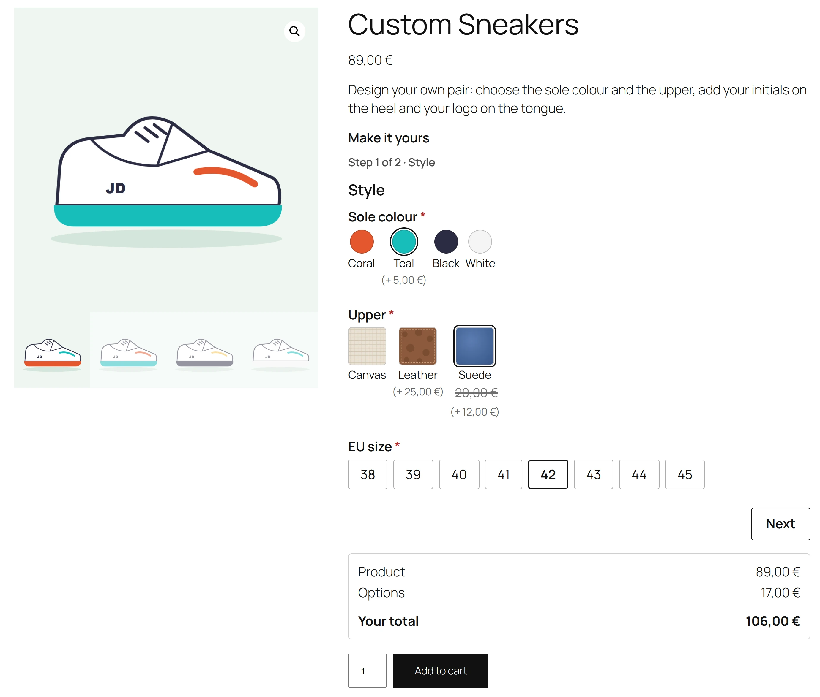
Only the look changes. The field stays a radio or checkbox field, so its prices, rules, required setting and limits work exactly as before.
Turning a field into swatches
- Select a Radio buttons or Checkboxes field.
- Open its Display tab.
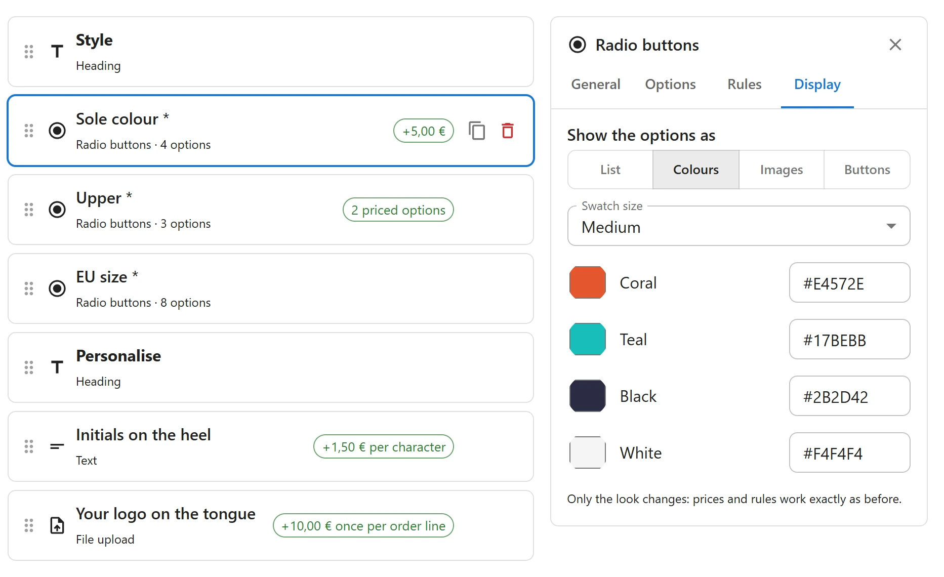
- Under Show the options as, pick Colours, Images or Buttons. List is the usual look.
- Pick a Swatch size: Small, Medium or Large.
- Give each choice its colour or image (see below).
Colour swatches
Each choice gets a colour: use the colour picker, or type a Hex colour such as #1f6f5b.
The swatch is a circle of that colour, with the choice’s label shown when the customer points at
it.
Image swatches
Each choice gets a picture: click Choose image to pick one from the Media Library, Change to replace it, or Remove image. Use small square pictures, such as a close-up of a fabric or a wood grain.
An image swatch can also change the main product picture when chosen: see Option images.
Buttons
Each choice shows as a button with its label, for sizes, quantities or short words. Nothing else to set.
For every customer
The real radio buttons and checkboxes stay in the page, hidden but working. Customers move between swatches with the arrow and Tab keys and choose with the space bar, screen readers read each choice’s label, and the form sends the same values as a list would. Prices beside the choices follow the Prices beside options setting.
Quick Links
Share