

Contents
Layouts - Plugixa Team
The layout is chosen on the view, and it is the single biggest decision about how a team reads. Eight ship in the box.
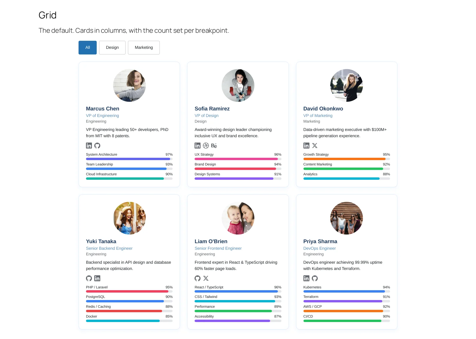
Choosing one
| Layout | Reach for it when |
|---|---|
| Grid | The default. An About page with photos that matter |
| List | A directory, where scanning beats browsing |
| Masonry | Bios are different lengths and a grid goes ragged |
| Carousel | A homepage strip with limited vertical room |
| Table | The team is really data: extensions, locations, roles |
| Filter | Visitors arrive looking for one department |
| Accordion | A long organisation nobody will scroll through |
| Inline | A row of faces inside a page of text |
Grid and list are in the free edition. The other six are Pro.
They are not skins
Switching layout is not a colour change: each one decides what fits and therefore what is worth showing. A table has no room for a bio, and an inline strip has no room for skills. The Display panel is where you say which fields survive the change.
What to do next
Start with Grid, or jump to the one your page needs.