

Contents
Grid layout - Plugixa Team
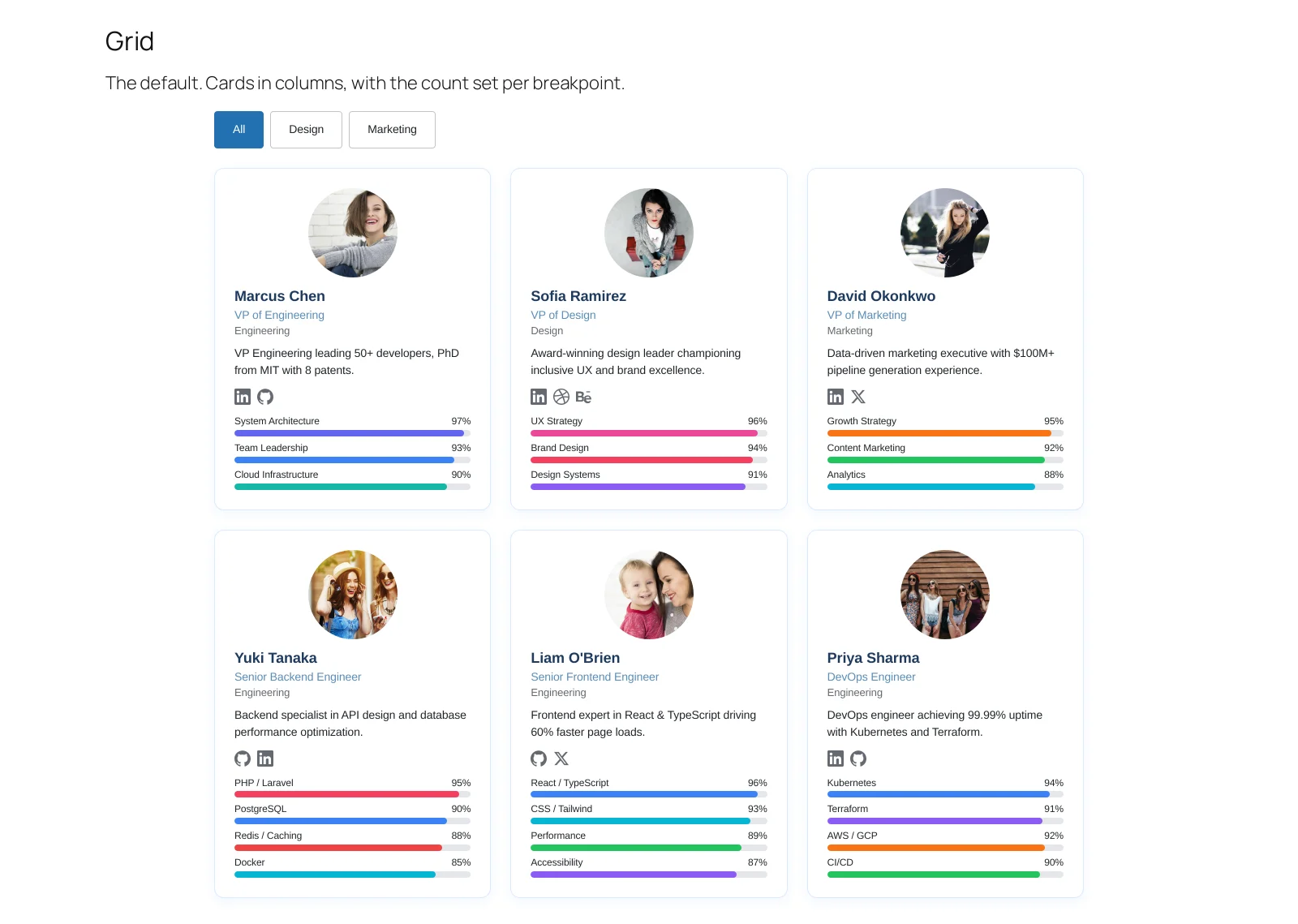
The one most sites want. Cards in columns, each carrying a photo, a name, a role, a bio, social links and skill bars.
Settings that matter
Columns, per breakpoint. Three on desktop, two on tablet, one on phone is the default and a sensible one. Two columns suit longer bios; four suit photo-led cards with little text.
What each card shows. The Display panel. A grid has room for a bio, and that is most of what separates it from a list.
Limit. How many appear before pagination. Pick a multiple of your column count so the last row is never half empty.
Why the card looks the same on every theme
Because it is the plugin’s card, with its own colours, spacing and radius, rather than whatever your theme does to a list item. That is deliberate: it means trying a new theme does not silently redesign your team page.
Troubleshooting
| What you see | Why | What to do |
|---|---|---|
| A ragged last row | The limit is not a multiple of the columns | Change one of them |
| Cards of uneven height | Bios differ a lot | Use masonry instead |
What to do next
List is the denser alternative.