

Contents
On a phone - Plugixa Team
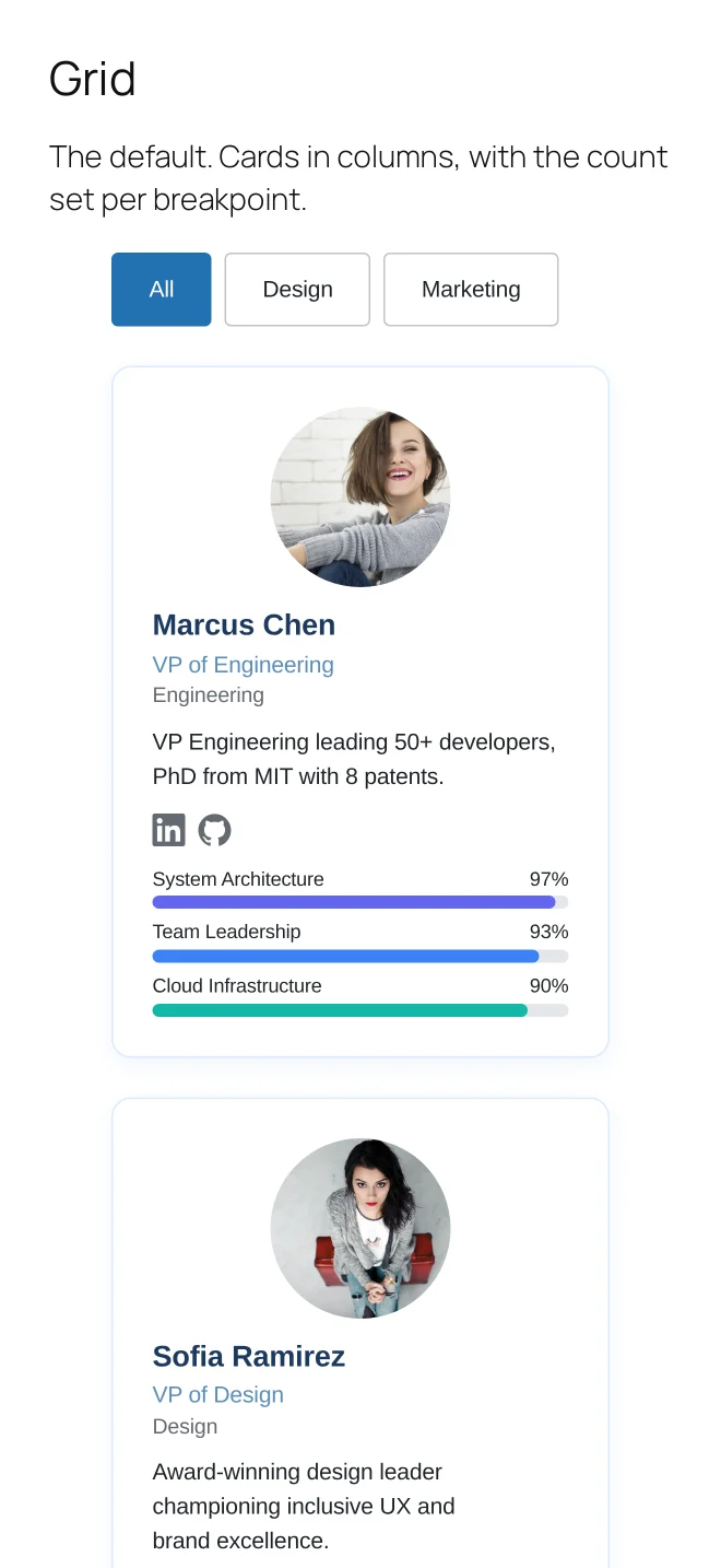
Every layout is responsive by design rather than by a media query bolted on afterwards. The column counts are settings, not breakpoints you have to guess.
What changes
Columns collapse to the count you set for tablet and phone, which is a field in the Layout panel rather than something to override in CSS.
The group navigation scrolls sideways instead of wrapping into three rows of tabs.
The carousel becomes a swipe. It already is one, but on a touch screen the arrows step back and let the gesture lead.
The table reflows into a stack rather than producing a horizontal scrollbar.
What to check on your own site
The photo size and the bio length. Both are fine on a desktop card and both are what make a phone card too tall to scan. The Display panel can drop the long bio for small screens while keeping it on the card elsewhere.
What to do next
Photos covers sizing and cropping.