

Contents
List layout - Plugixa Team
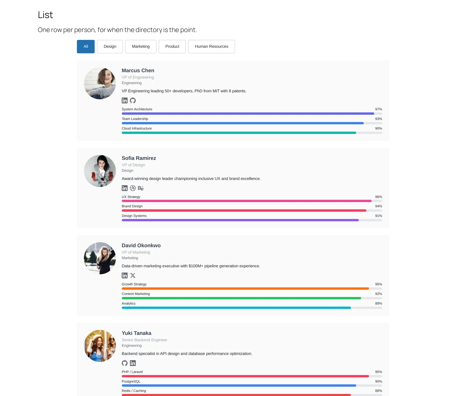
One row per person: photo on the left, detail on the right. Denser than a grid, and far easier to scan when the team is forty people rather than eight.
When a list beats a grid
When the visitor is looking for somebody rather than admiring everybody. A grid asks you to read left to right and down; a list gives one vertical column of names, which is how people actually scan for a person.
It is also the better layout on a phone, where a grid collapses to one column and becomes a very long list of very tall cards anyway.
Settings that matter
Display. A row has room for a name, a role, a department and a short bio. Turn the long bio off here; it is what makes a list stop being a list.
Pagination. Lists are where paging earns its keep. Twenty per page keeps the page quick without hiding people.
What to do next
Masonry handles uneven card heights.