

Contents
Spacing - Plugixa Team
Two numbers that do more for how a team looks than any colour: the gap between cards, and the padding inside them.
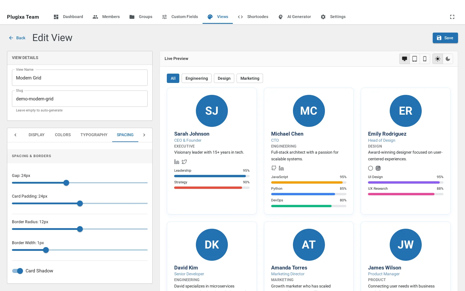
Gap
The space between cards. Too little and a grid reads as one block; too much and it stops reading as a group at all. It matters most in masonry, where the gap is the only thing separating cards of different heights.
Padding
The room inside a card. This is the setting that rescues a cramped design: a card that feels cluttered usually has enough room and is not using it.
Radius
Corner rounding, set here too. Match it to whatever your theme does with buttons and panels and the team section stops looking like a separate component.
What to do next
Photos for shape and cropping.