

Contents
Table layout - Plugixa Team
Where this appears: the Layout panel of any view, once Pro is installed.
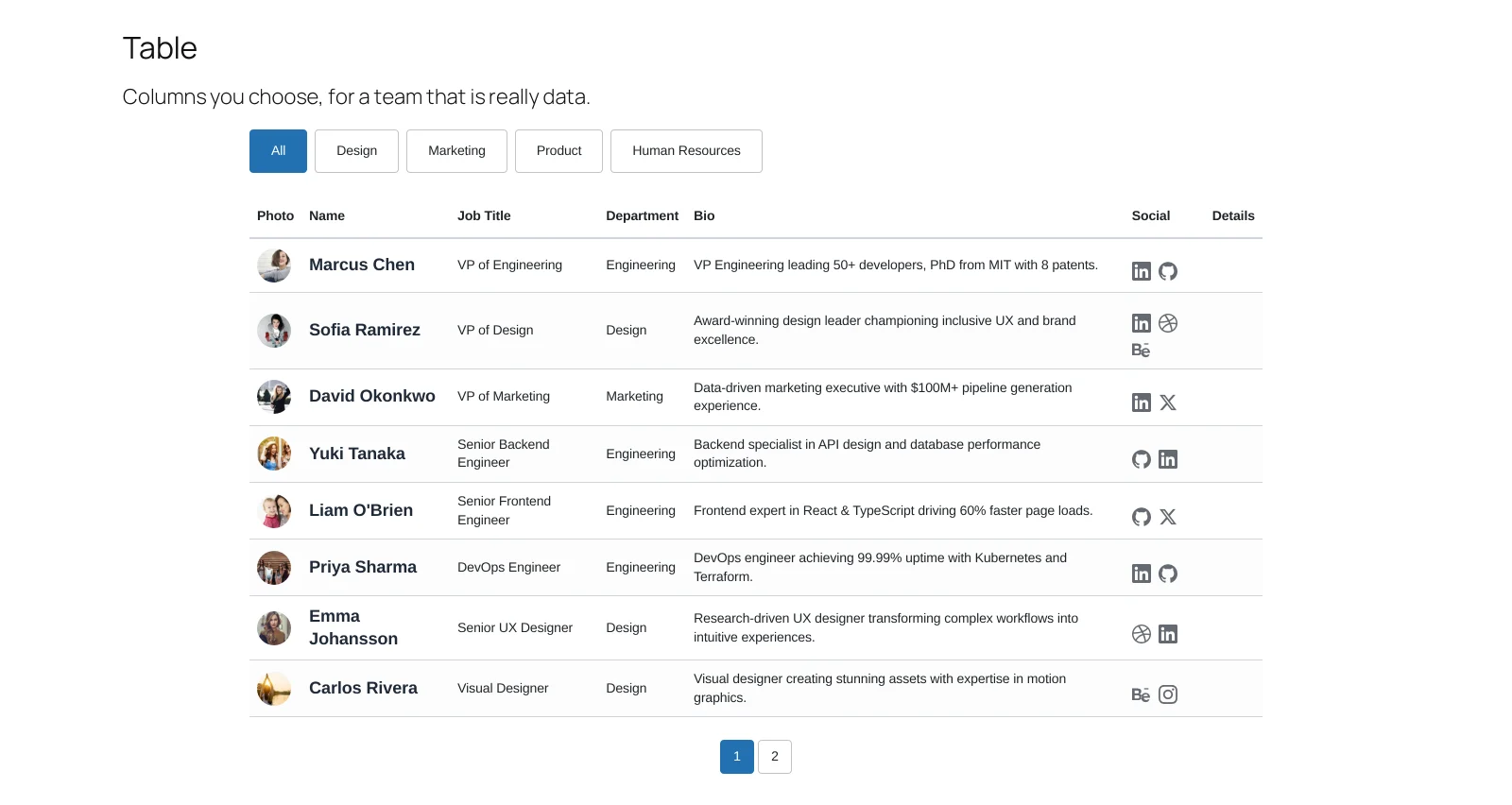
Sometimes a team is data. A staff directory with an extension, a location and a role is a table, and pretending it is a set of cards makes it harder to use.
When to use it
When somebody will come to the page to look something up rather than to be impressed. Internal directories, faculty lists, a support roster.
Settings that matter
Display decides the columns. Keep it to what somebody would actually scan for: a table with nine columns is a spreadsheet, and a spreadsheet on a phone is nothing at all.
Photo can be switched off entirely here, and often should be. A thumbnail per row is charming at ten rows and noise at a hundred.
On small screens
The table reflows rather than scrolling sideways, so a phone gets a readable stack instead of a horizontal scrollbar nobody finds.
What to do next
Filter when visitors want one department.