Contents

Views — Plugixa Team

A view is a reusable visual design preset — layout, colors, typography, spacing, photo style, dark mode, pagination, groups nav, and more. Views decouple “how it looks” from “what members are shown”, so you can swap styles without recreating shortcodes.

Open Plugixa Team → Views.

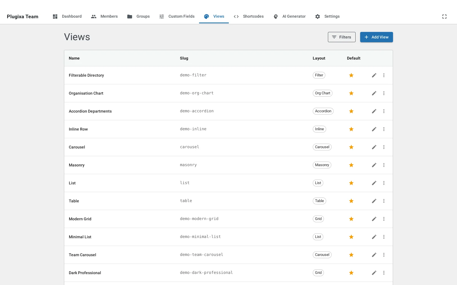
Views list

How views fit together

Shortcode ─────┐
               │   overrides display / pagination / dark mode
               ▼
            View ──────────┐
                           │   overrides global settings
                           ▼
                     Plugin Settings (defaults)

Priority order (highest wins):

  1. Shortcode attribute[plugixa_team show_bio="0"] wins.
  2. Shortcode’s config.display / pagination / darkMode — saved in the shortcode record.
  3. View config — all visual properties.
  4. Global settings — Plugin-wide defaults.

Layouts

Plugixa Team ships 9 layout styles:

Layout Tier Description
Grid Free Responsive card grid. Configurable columns for desktop / tablet / mobile.
List Free Vertical list with optional side-by-side photo/content.
Masonry Free Pinterest-style CSS columns with varying card heights.
Carousel Free Swiper 11.x slider with 7 transition effects (slide, fade, cube, coverflow, flip, cards, creative).
Table PRO Directory-style table with photo, name, job title, department, email, phone.
Inline PRO Compact name badges (photo + name chip).
Filter PRO Filterable grid with a group-filter button row.
Accordion PRO Expandable items with header + collapsible body.
Org Chart PRO Parent/child hierarchy rendered as a tree.

Select the layout from View → Layout tab → Style. Every other tab adapts to the selected layout (e.g., Table hides typography/spacing/skills tabs; Carousel hides pagination).

The view editor

View editor

The edit form is split into two columns:

  • Left (4 cols) — Name, Slug, Description, plus a tabbed configuration panel.
  • Right (8 cols) — Sticky live preview with viewport switcher (desktop / tablet / mobile) and a light/dark mode toggle.

The preview uses the same CSS classes and CSS variables as the frontend, so what you see in the preview is what renders on the page.

Tab overview

Tab What it controls
Layout Layout style, columns, carousel options (effect, autoplay, loop, arrows, dots, space between, …).
Display Show/hide toggles for photo, name, job title, department, bio, short bio, social, skills, email, phone, location, hire date, ribbon, website. Excerpt length, content position (below/overlay).
Colors Card bg, text, name, job title, department, border, ribbon bg/text, social icon colors, skill bar colors.
Typography Font size + weight for name, job title, department, bio.
Spacing Card padding, gap, photo padding.
Photo Size, border radius, border, grayscale, opacity, fallback mode (initials/icon/none), fallback bg/text colors, position (top/bottom/left/right/inline), hover scale, shadow.
Social Icon size, color, hover color, spacing, display style (flat/bordered/filled).
Skills Bar height, radius, bg color, show percentage, show label, label font size, style.
Groups Nav Enabled, style (tabs/pills/dropdown/sidebar), show “All”, show member count, show description, colors, spacing, typography, border.
Pagination Enabled, style (numbers/load_more/infinite_scroll), per-page count, alignment, per-style colors (numbers / load-more / infinite-scroll).

Hidden tabs per layout

Some tabs hide irrelevant options to keep the editor focused:

  • Table — Typography, Spacing, Skills are hidden. Display hides contentPosition. Photo hides size/position/effects (only fallback controls remain). Social hides hover color and spacing. Pagination disabled.
  • Carousel — Pagination tab disabled (carousels use Swiper’s own pagination dots; configure via Layout tab).
  • Org chart — Most “card” styling applies to nodes; advanced card options are hidden.

Dark mode

A view has a full darkMode config section — its own colors, ribbon, groups nav colors, etc. Toggle the live preview between light and dark with the Light / Dark button in the preview toolbar.

Shortcode dark_mode Effect
disabled (default) Use light colors.
enabled Force dark mode regardless of view setting.
auto Follow the visitor’s prefers-color-scheme.

Override from the shortcode: [plugixa_team dark_mode="auto"].

Photo positions

From the Photo tab:

Position Effect
top (default) Photo above content, centered.
bottom Photo below content.
left Side layout, photo left of content.
right Side layout, photo right of content.
inline Photo inline with content (compact).

Setting position to left or right automatically enables the side layout for cards — no separate toggle.

Content position (grid layout only)

Value Effect
below (default) Content stacked below the photo.
overlay Content overlaid on the photo with a dark gradient, white text, and max-height: 70%.

Pagination styles

The Pagination tab (disabled for carousels) offers three styles:

  • Numbers — clickable page numbers with active state. Server-side AJAX loads the next page.
  • Load More — button at the bottom; appends the next page below. Configurable label.
  • Infinite Scroll — auto-loads as the user scrolls.

Per-style colors: background, text, border, active states.

The default view

Exactly one view can be the default. New shortcodes inherit the default view’s settings. To change the default:

  • From the Views list, click the star icon in the row — optimistic UI updates instantly.
  • Or from the view form, check Set as default.

The default is stored in views.is_default (max one row with 1).

Duplicate a view

Click the Duplicate row action. A copy is created with -copy appended to the slug; tweak it and save.

REST API

GET    /wp-json/plugixateam/v1/views?limit=20&offset=0&layout_style=grid
POST   /wp-json/plugixateam/v1/views
GET    /wp-json/plugixateam/v1/views/{id}
PUT    /wp-json/plugixateam/v1/views/{id}
DELETE /wp-json/plugixateam/v1/views/{id}
POST   /wp-json/plugixateam/v1/views/{id}/duplicate
POST   /wp-json/plugixateam/v1/views/{id}/set-default
GET    /wp-json/plugixateam/v1/views/default-config
DELETE /wp-json/plugixateam/v1/views/bulk

How view config maps to CSS

Every field in the View config is mapped to a --pxt-* CSS custom property, applied as an inline style on each shortcode’s root .pxt-custom-team-root element. This ensures per-instance scoping — two shortcodes with different views on the same page don’t collide.

Key variables:

.pxt-custom-team-root {
  --pxt-card-bg: #ffffff;
  --pxt-name-color: #111827;
  --pxt-name-font-size: 18px;
  --pxt-gap: 20px;
  --pxt-border-radius: 8px;
  --pxt-photo-size: 120px;
  --pxt-photo-radius: 50%;
  /* … 40+ more … */
}

See Hooks → Template override guide for subclassing/overriding CSS.

Live preview internals

Live preview of a view

The preview component (ViewPreview) renders using real pxt-custom-* classes and the --pxt-* variables, same as the frontend PHP templates. This means:

  • Color changes are visible instantly, without a rebuild.
  • The viewport toggle (desktop / tablet / mobile) forces the grid column count so you can test responsive designs in real time.
  • Switching dark mode remaps variables so the preview matches the frontend exactly.

Troubleshooting

Changes in the view editor aren’t reflected on the frontend

  • Save the view (the preview updates in memory but changes aren’t persisted until you click Save).
  • Clear any page or object caches — views render CSS variables inline, but some cache plugins strip style attributes.

Dark mode looks washed out

  • Both light and dark color sets are edited independently. Switch the preview to Dark before picking dark-mode colors.
  • Check darkMode.enabled is on for the view, and dark_mode attribute is enabled or auto (not disabled).

Table layout missing on my install

The Table layout is a Pro feature. Check your license at Plugixa Team → Account.

  • Shortcodes — overrides that override view config
  • Groups — groups nav configuration lives here
  • Settings — plugin-wide defaults

Quick Links