

Contents
The view editor - Plugixa Team
Everything about how a team looks lives here, and the preview to the right of the panels redraws as you change things. Nothing has to be published to be judged.
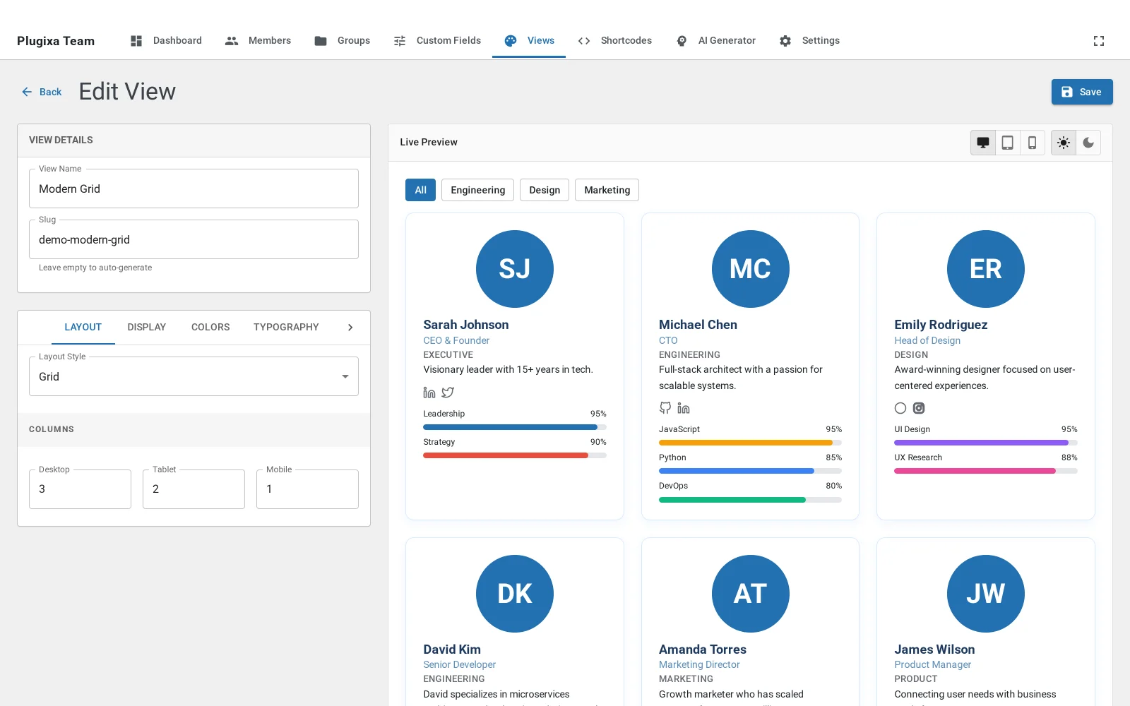
The ten panels
| Panel | What it controls |
|---|---|
| Layout | The layout style, column counts per breakpoint, ordering and limit |
| Display | Which fields appear on a card |
| Colours | Card, text, name, role, border and ribbon colours, and dark mode |
| Typography | Sizes and weights for name, role and body |
| Spacing | Gap between cards and padding inside them |
| Photo | Shape, size, position and what happens when there is no photo |
| Social | Which profiles show and how the icons look |
| Skills | Whether skill bars appear, and their style |
| Groups Nav | The group filter above the layout |
| Pagination | Page size and the style of the control |
Each has its own page in this documentation, linked from the sections that follow.
A note on the preview
The preview uses sample people rather than your own, so it looks the same on a site with four members and one with four hundred. What it is showing you is the design, not the data.
What to do next
Layouts is the tour of all eight.