

Contents
Icons and animation - Plugixa FAQ
Where this appears: the FAQs and Behavior tabs of the view editor.
The icon tells a visitor a row is clickable, and the animation tells them what just happened. Both are small, and both are the difference between a list that feels responsive and one that feels broken.
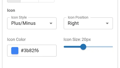
Icon styles
| Style | Reads as |
|---|---|
| Chevron | Rotates to point down when open. The clearest, and the default |
| Plus | Becomes a minus. Unambiguous, slightly heavier |
| Caret | A smaller chevron, for dense lists |
| None | No affordance at all |
None is worth avoiding unless the row is obviously interactive some other way. Without an icon a visitor has to discover that the row clicks, and many will not try.
The icon has its own colour, so it can sit quietly against a strong header row.
Animation
Set on the Behavior tab: a duration and an easing curve.
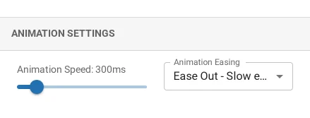
Around 200 to 300 milliseconds is the range worth staying in. Faster than about 150 and the answer appears to jump, which loses the connection between the click and the result. Slower than about 400 and every click feels like waiting.
ease-out suits opening: quick to start, settling at the end.
Reduced motion
Visitors who have asked their system for reduced motion get the state change without the transition. That is automatic rather than a setting, because it is an accessibility requirement and not a preference of yours.
Troubleshooting
| What you see | Why | What to do |
|---|---|---|
| The icon does not rotate | The style is plus or none | Chevron and caret rotate; plus swaps to a minus |
| The animation is jerky | An image in the answer loads late and changes its height | Set width and height on images in answers |
| Nothing animates | The visitor has reduced motion turned on | Working as intended |
| The icon is invisible | Its colour matches the row | Give it its own colour |
What to do next
Category filters is the next panel along.