

Contents
On a phone - Plugixa FAQ
Where this appears: the device toggle above the live preview, and every front-end placement.
FAQ pages get read on phones more than most pages, because people look things up while they are doing something else. The layouts reflow rather than shrink.
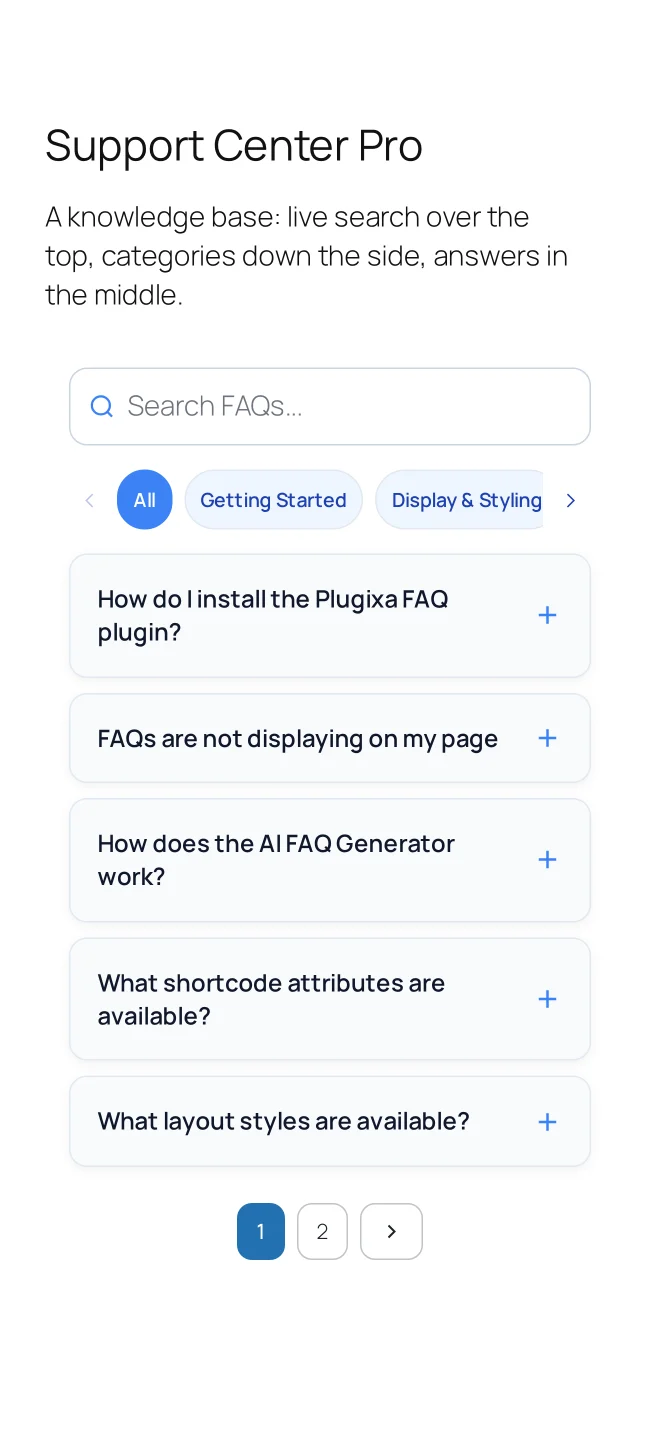
What each layout does
Accordion is already a single column, so it changes least. The row keeps its tap target and the icon stays where it was.
Horizontal stops being horizontal. The side-by-side panels stack into a single column and behave like an accordion, which is the right answer: four panels on a 390px screen would be four slivers.
Timeline keeps its line but tightens the spacing, so a sequence still reads as a sequence without three screens of scrolling between nodes.
Category filters switch to a scrollable row or a dropdown depending on the style you chose. This is the setting most worth checking at phone width, because tabs that were fine at desktop can become a two-line block that pushes the first answer off the screen.
Tap targets
Question rows are sized to be comfortable to tap rather than to click. If you reduce the row padding a long way in the view’s spacing settings, check the result on a phone before publishing: a 28px row is fine with a mouse and frustrating with a thumb.
Check it in the preview
The device toggle above the live preview switches between desktop, tablet and phone widths. It is faster than resizing a browser and it uses your real answers, so your longest question is in front of you.
Troubleshooting
| What you see | Why | What to do |
|---|---|---|
| Horizontal panels are still side by side | A theme container is forcing a width | Check for a fixed width or min-width on the wrapper |
| The filter bar pushes answers off screen | Tabs with too many categories | Switch to a dropdown for small screens |
| Text is tiny | The theme scales type by viewport | Check at phone width in the preview |
| Rows are hard to tap | Row padding was reduced | Raise the item spacing on the view |
What to do next
The shortcode is the full attribute reference.