

Contents
Colours - Plugixa FAQ
Where this appears: the FAQs tab of the view editor.
Every colour in a design is set here, on the view, and applied through scoped CSS variables rather than a stylesheet. That is why two shortcodes on one page can carry different palettes without either bleeding into the other.
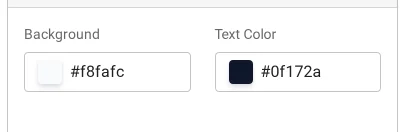
What you can set
The question row and the answer body each have their own background and text colour, so a tinted header over a white answer is two settings rather than a CSS override. Borders have their own colour and width, and the icon has its own so the chevron can be quiet against a loud header.
Hover and active states are derived rather than set individually, which keeps the number of decisions down and stops a design drifting out of step with itself.
Set dark at the same time
Use the light and dark toggle above the live preview and set both while the design is in front of you. Coming back to the dark values later is how you end up with grey-on-black. See dark mode.
Contrast is worth checking
The preview shows real answers, so if your question text is too light against its row you will see it immediately. Body text under about 4.5:1 against its background is hard work for a lot of readers and fails WCAG AA; the plugin does not stop you, but the preview is there to make it obvious.
Custom properties
Each placement gets its own --pxf-* variables, scoped to that root. If you
want to go further than the panel allows, override those in your theme rather
than targeting the plugin’s classes, which is both less fragile and scoped to
the one placement you meant. See hooks.
Troubleshooting
| What you see | Why | What to do |
|---|---|---|
| A colour has no effect | The theme sets it with higher specificity | Override the --pxf-* variable instead of the class |
| Two FAQ blocks on one page look the same | Both point at the same view | Duplicate the view and repoint one |
| Dark looks washed out | Only the light palette was set | Toggle the preview to dark and set those values |
| The icon disappears on hover | Its colour matches the hover background | Give the icon its own colour |
What to do next
Typography is the next panel along.