

Contents
On this page
Appearance - Plugixa Stream
One set of style settings dresses everything viewers see: the Watch app, the shortcodes and blocks on your pages, and the Stream page templates. Change a colour and it reaches all of them on the next page load. There is nothing to rebuild or re-save.
Open Plugixa Stream -> Settings -> Appearance, make your changes and click Save.
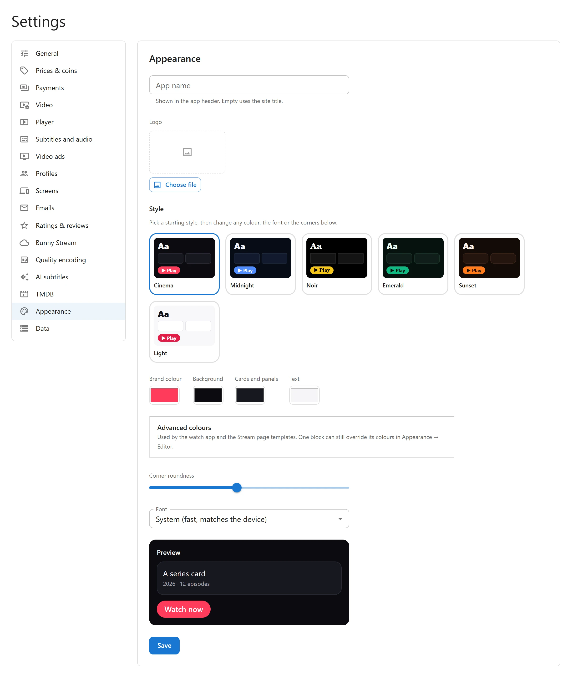
App name and logo
| Field | What it does |
|---|---|
| App name | The name in the Watch app’s header and in the browser tab. Empty uses your site title. |
| Logo | An image from the Media Library, shown in the header before the app name. |
Style presets
Style offers six ready-made looks. Clicking one fills in every colour, the font, the corner roundness and the banner shade at once. It is a starting point: change anything afterwards and the style shows as custom. Click a card again to start over from it.
| Style | Brand colour | Background | Font | Corners |
|---|---|---|---|---|
| Cinema (default) | #ff3b5c |
#0b0b10 |
System | 14 |
| Midnight | #4f8cff |
#070b16 |
System | 10 |
| Noir | #f5c518 |
#000000 |
Serif | 4 |
| Emerald | #10b981 |
#06120e |
Rounded | 18 |
| Sunset | #ff7a1a |
#140b08 |
Rounded | 22 |
| Light | #e11d48 |
#f7f7fa |
System | 12 |
Your site keeps the values themselves, not the name of the style, so a future update never restyles your site behind your back.
Light or dark
The app has one look at a time; it does not switch with the viewer’s device setting. Light is the light style, with a pale background and dark text. The other five are dark. To make your own, pick the closest style and change its colours.
Colours
The four main colours:
| Field | Used for |
|---|---|
| Brand colour | Buttons, badges, progress bars, the selected tab and links |
| Background | The page behind everything |
| Cards and panels | Posters without art, panels, the search box, the player’s sheets |
| Text | Titles and body text |
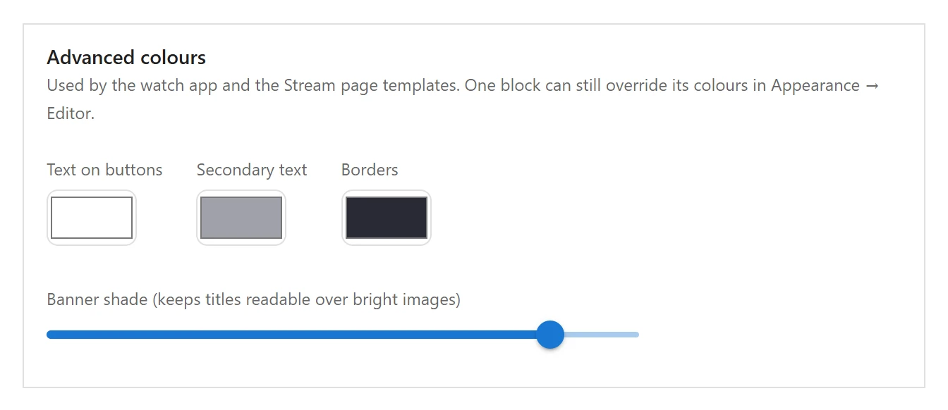
Advanced colours opens three more, plus the banner shade:
| Field | Used for |
|---|---|
| Text on buttons | Text on a brand-coloured button or badge |
| Secondary text | Facts lines and other quieter text on the page templates and blocks |
| Borders | Lines around genre chips and the Add to My List button on the page templates |
| Banner shade | How dark the fade over a series banner is, 0 to 100%, so titles stay readable on bright images |
Readable buttons, automatically. A bright brand colour can be hard to read under white text. Where your brand colour fills a button or badge, the plugin darkens it (or lightens it, for dark button text) just enough for the text to reach a 4.5:1 contrast ratio. Text and accents in your brand colour keep the exact shade you picked.
Corner roundness and font
| Field | Values | Default |
|---|---|---|
| Corner roundness | 0 (square) to 32 | 14 |
| Font | System (fast, matches the device), Rounded, Serif, Same as my theme | System |
The fonts are the device’s own, so nothing is downloaded from a font service and no visitor data goes to a third party. The system and serif choices include fonts for Arabic script.
Same as my theme uses the font your theme sets, on the pages where your theme’s styles load: the series pages, the page templates and pages with embeds. The Watch page does not load your theme’s stylesheets, so to use a brand font there, pick one of the other choices.
The Preview box at the bottom shows a card and a Watch now button in your current choices before you save.
Where it applies
- The Watch app, all of it, including the player’s panels.
- Shortcodes and blocks on your pages. See Shortcodes and Blocks.
- The Stream page templates on a block theme. Their body is painted in the Stream colours by the Stream colours style of the group block that wraps it. On a light theme you can turn that style off in the Site Editor to let your theme’s colours show. See Page templates.
Colours in the Site Editor
The block editor’s colour picker gets five extra swatches: Stream brand, Stream background, Stream cards, Stream text and Stream muted text. A block coloured with one of them follows the setting when you change it later.
Each Stream block can also take its own background, text and link colours from the block sidebar, overriding the settings for that one block.
Quick Links
Share