

Contents
On this page
Exam screen designs - Plugixa Exam
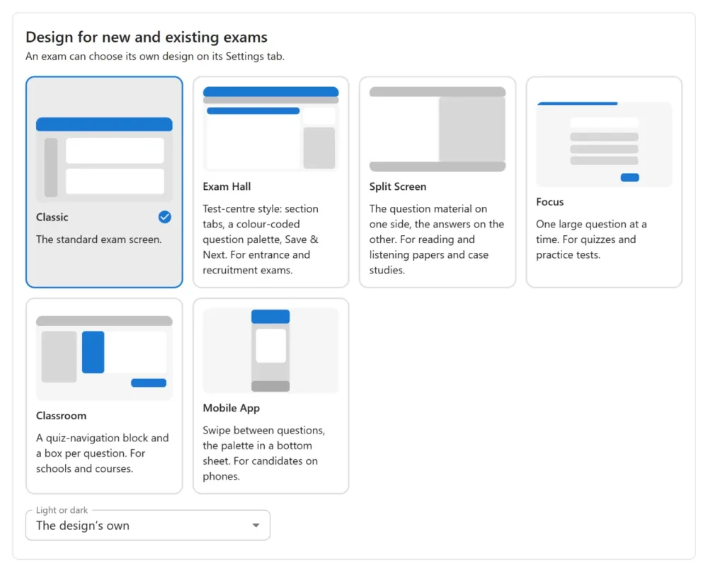
The exam screen has a built-in look, Classic. With Plugixa Exam Pro you can replace it with one of five designs, for the whole site or for one exam, and give it your own colours and font. Only the frame changes. Saving, the timer, the question types, marking and the result page work the same in every design.
The five designs
All five are light, calm designs built from the same parts: a header card with the exam title, the time left and Submit, white question cards on a soft page, and one dark main button.
| Design | What it looks like | Good for |
|---|---|---|
| Exam Hall | Section tabs over the question, its marks beside it (+4 / −1), and a side panel with the current section’s question palette and a legend that counts each colour. | Entrance and recruitment exams with sections and negative marking |
| Split Screen | The question on one side and the answer on the other, with a divider you can drag between them, and text-size buttons (A− / A+) in the header. | Reading and listening papers, case studies, data interpretation |
| Focus | One large question at a time with a big question number, large answer cards and a thin progress bar. | Quizzes, practice tests, short assessments |
| Classroom | A “Quiz navigation” block with a square per question, grouped by section, and an info column beside each question with its status, marks and penalty. Previous page and Next page sit below. | Schools, universities and course quizzes |
| Mobile App | A coloured header with the time and section chips, one question card, and swipe left or right to move. A bottom bar has large buttons; the palette opens in a bottom sheet. On a computer it stays phone-width in the middle of the window. | Candidates who sit exams on their phones |
What each design looks like
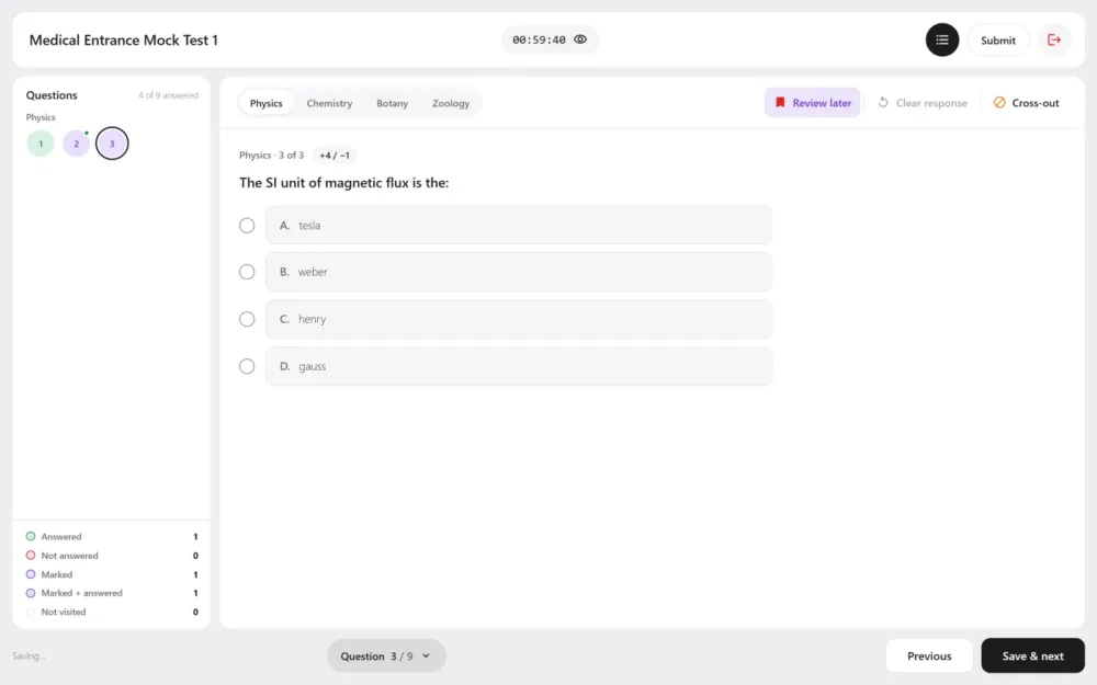
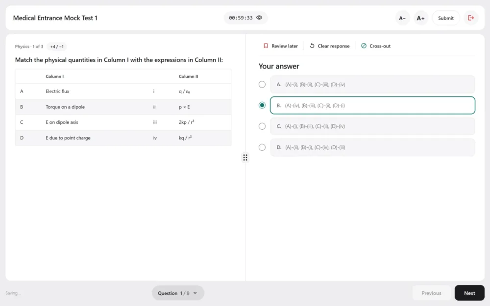
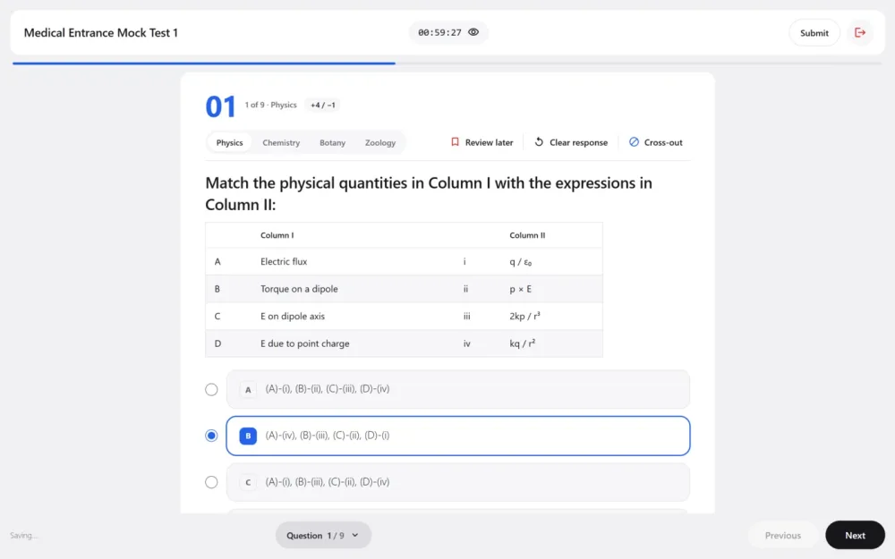
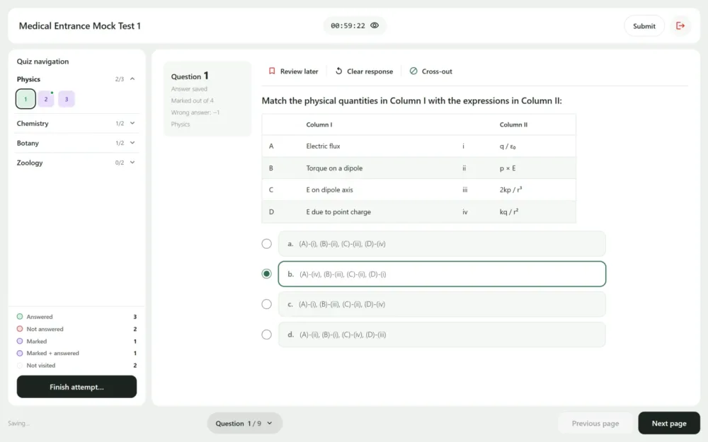
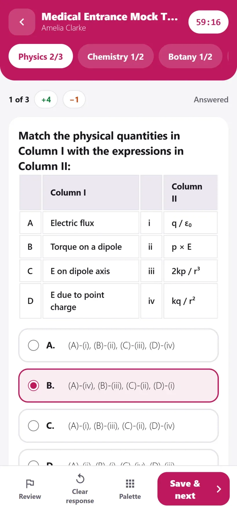
Every design has:
- a Question n / total button at the bottom that opens a jump list, section by section
- Review later, Clear response and Cross-out. Cross-out lets the candidate strike out an option they have ruled out. It is only a visual aid and does not change the answer.
- a Saved indicator that shows when answers reach the server.
Phones and tablets
Every design works from a 375 px phone up to a wide desktop without scrolling sideways. On a tablet the side panels fold behind a button. On a phone the tools become icons, the panes of Split Screen stack, and Submit becomes a round icon in the header. In Exam Hall, Submit sits in the question panel instead.
The question palette colours
The palette and its legend show where the candidate stands on every question:
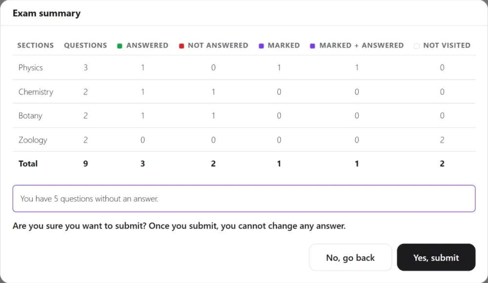
- Answered: the question has an answer.
- Not answered: the candidate opened it and left it blank.
- Marked: marked for review, with no answer.
- Marked + answered: marked for review, with an answer. It is marked like any other answer.
- Not visited: never opened.
“Not visited” is kept in the candidate’s browser. On another device it is rebuilt from what the server knows: a saved answer, a mark for review, or the last question open.
Before the final submit
Every design shows an Exam summary before it submits. It is a table of each section’s answered, unanswered, marked and unvisited questions, followed by “Yes, submit” or “No, go back”. If the exam requires an answer to every question, the submit is still refused until they are answered.
Choosing a design
- For the whole site: Settings › Exam screen. Pick the design used by every exam that has not chosen its own.
- For one exam: open the exam; under Exam screen design, pick one. Site default follows the site’s choice.
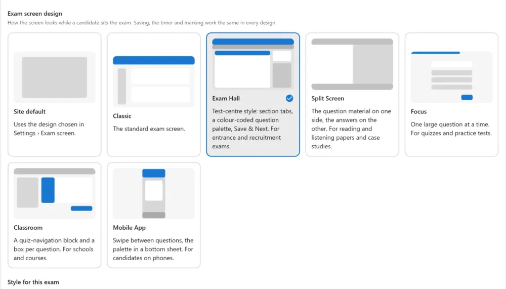
A design shows one question at a time, whatever the exam’s Layout says.
The exam’s Hide the site’s menu and footer during the exam switch (under Exam environment) decides the frame. On, the design fills the window like a test centre. Off, it sits inside your page, between your theme’s menu and footer.
Style: colours and font
Settings › Exam screen › Style sets, for every design:
- the font: the design’s own, your theme’s font, system sans-serif, serif, rounded, or a font my site already loads (type its family name, for example Inter). Fonts are never downloaded from another site.
- the background behind the cards, the cards, the header background and its text, the text, the main button (Next, Submit) and its text, and the accent (chosen answers, highlights)
- the five question palette colours, also used in the legend.
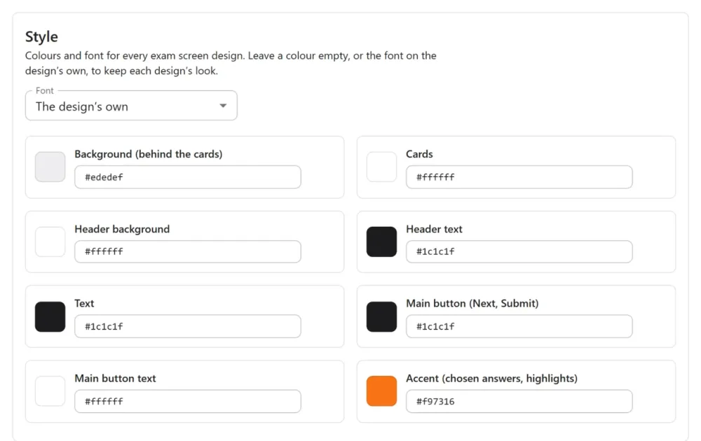
Each field shows the colour in effect. A field you leave alone stores nothing, so each design keeps its own look and a newly chosen design brings its own colours. Use the design’s own undoes a change. The colour picker offers the design’s own colours as one-click swatches.
If you choose a header or button colour but not its text colour, the text stays as the design has it while it is readable. On a colour it cannot be read against, it turns white or near-black automatically.
Light or dark chooses the mode for every design.
Style for one exam
Every one of these can also be set for a single exam, under Style for this exam beside its design. The exam’s own choice wins, then the site’s, then the design’s own. Each field shows what the exam uses now; Use the site’s goes back to the site’s choice. For the font, The site’s choice follows the site and The design’s own ignores it.
Sections and marks
The section tabs and section groups come from the exam’s sections, in paper order, with their titles. The titles are frozen into a sitting when it starts, so editing the exam mid-sitting does not rename a candidate’s sections. The “−1” beside a question is the question’s negative marking, shown by the same rule the marking uses. It shows only what a wrong answer costs, never which answer is right.
Long exams stay quick: the palette and lists show one section at a time and keep the current question in view, tested with 200 questions in four sections of 50.
Switching it off
The designs are an app in the App manager (Exam screen designs). Switch it off and every exam goes back to Classic on its next page load. A candidate in the middle of a sitting keeps their answers and time.
Quick Links
Share