

Contents
On this page
Visitor screen styles and cover images - Plugixa Exam
The visitor screens are the exam list, each exam’s page, My learning (My exams, My results, My certificates) and the certificate check. The exam screen itself, where questions are answered, has its own designs: see Exam screen designs.
Cover images
Every exam can have a cover image. Open the exam, stay on the General tab and press Choose image under Cover image. You can upload a new picture there or pick one you uploaded before.
- The image shows on the exam’s card in the list and at the top of the exam page.
- A wide picture works best. Cards crop to 16:9; the exam page banner is wider still.
- The alt text comes from the media library, so set it there.
- An exam without a cover shows a tile in your main colour with the first letter of its title, so the list stays even.
The three styles
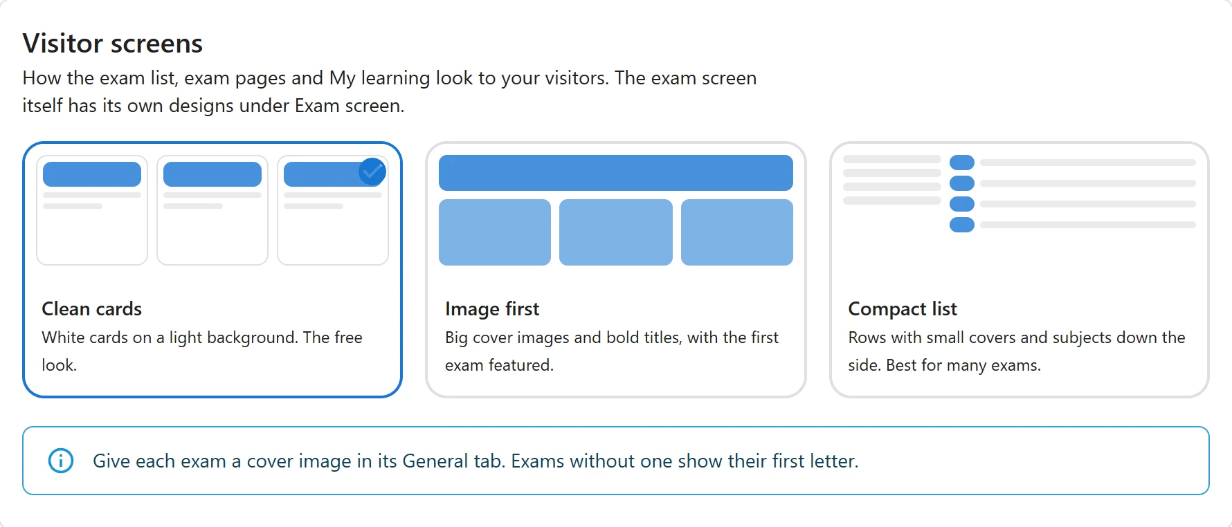
| Style | Plan | What it looks like |
|---|---|---|
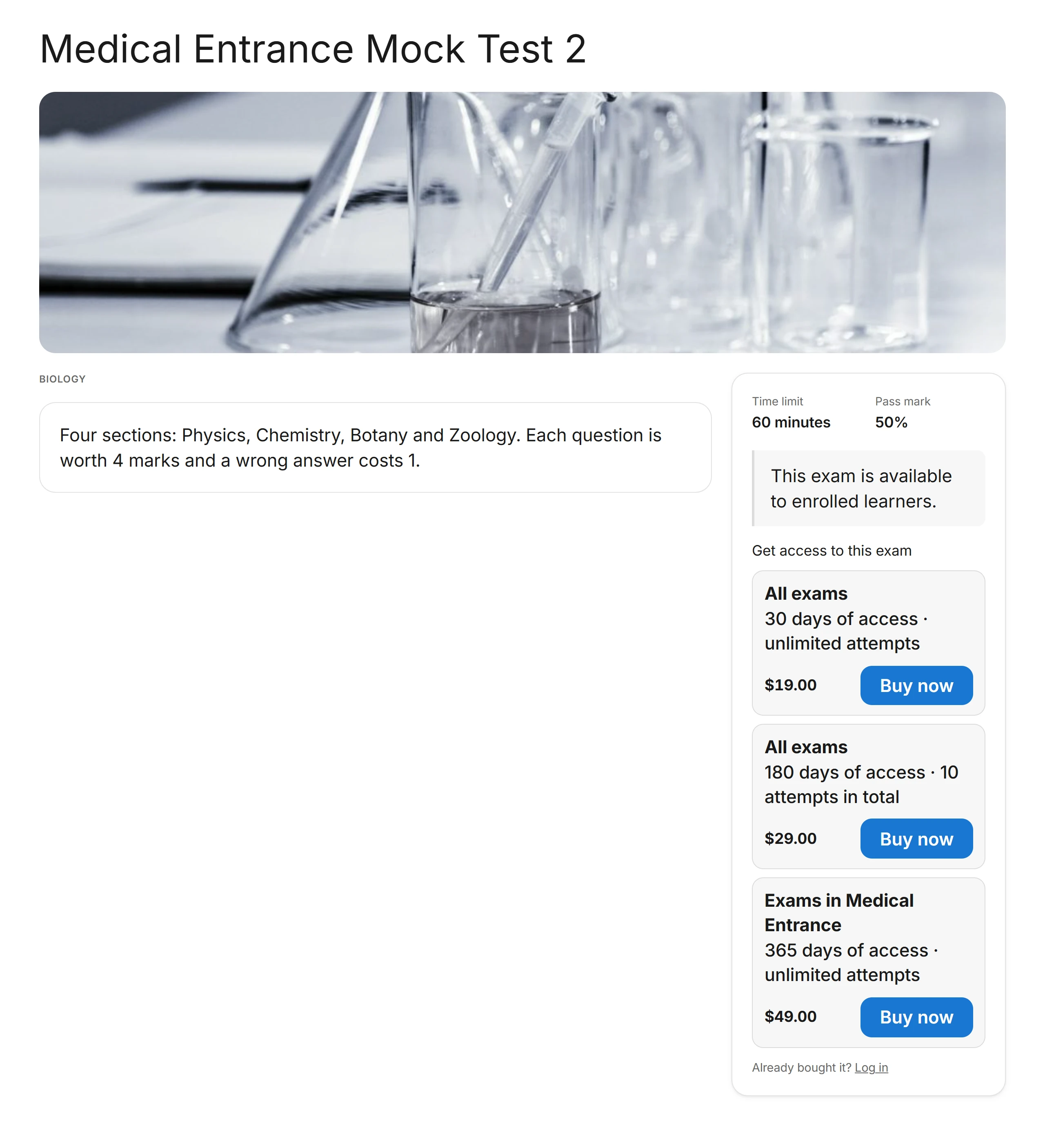
| Clean cards | Free, the default | White cards on a light background, a subject row of chips, and a side panel with the facts and the Start button on each exam page |
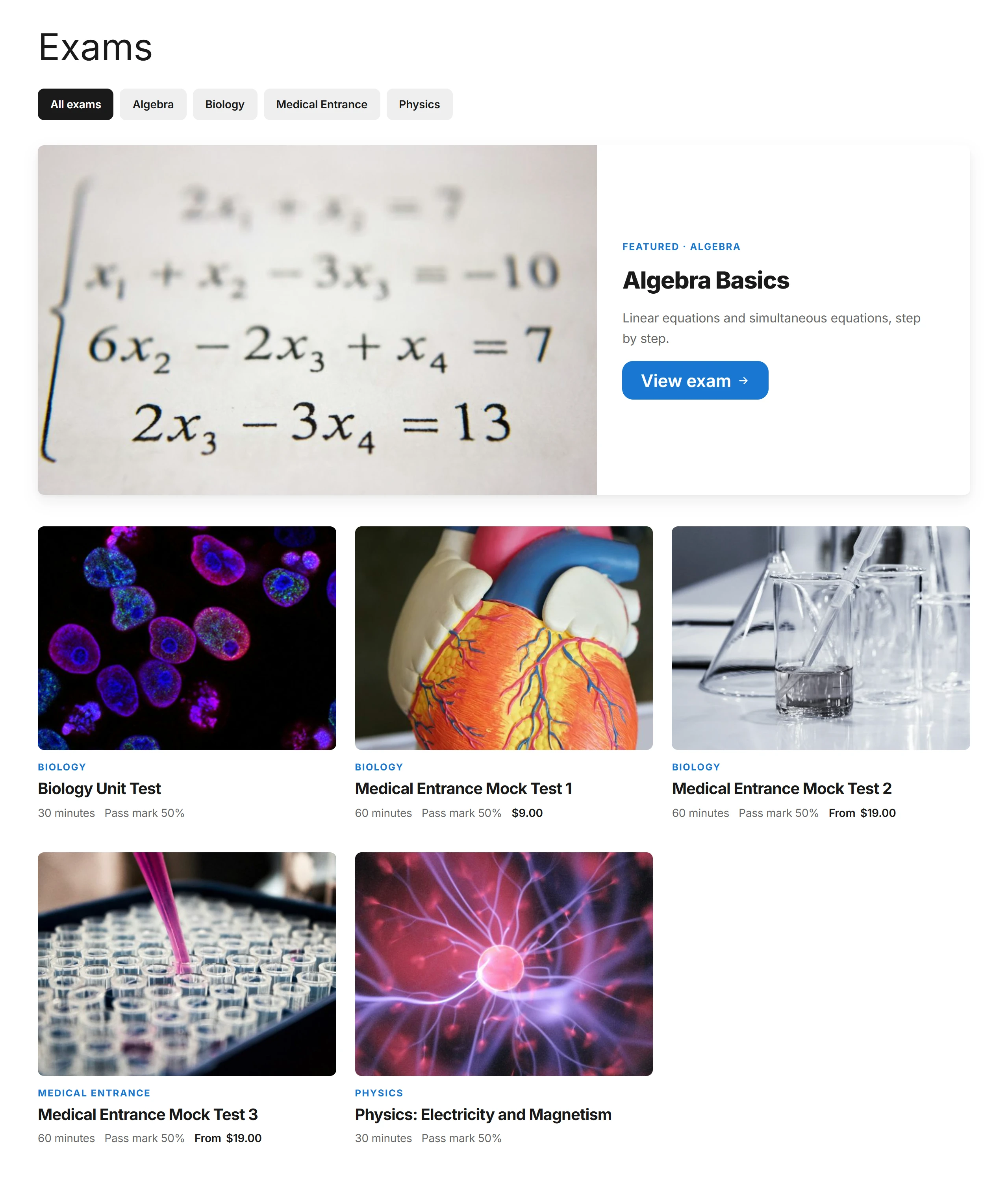
| Image first | Premium | Big 4:3 covers with the learner’s result on the picture, bold titles, the first exam featured at the top, and a wide banner on each exam page |
| Compact list | Premium | Exams as rows with small covers, subjects down the side with a count, and the facts as a table. Made for sites with many exams |
Choose one under Settings › Visitor screens (Premium). Without Premium, or with the Visitor screen styles app switched off in the App manager, the site uses Clean cards.
My learning and the certificate check look the same in every style.
Clean cards
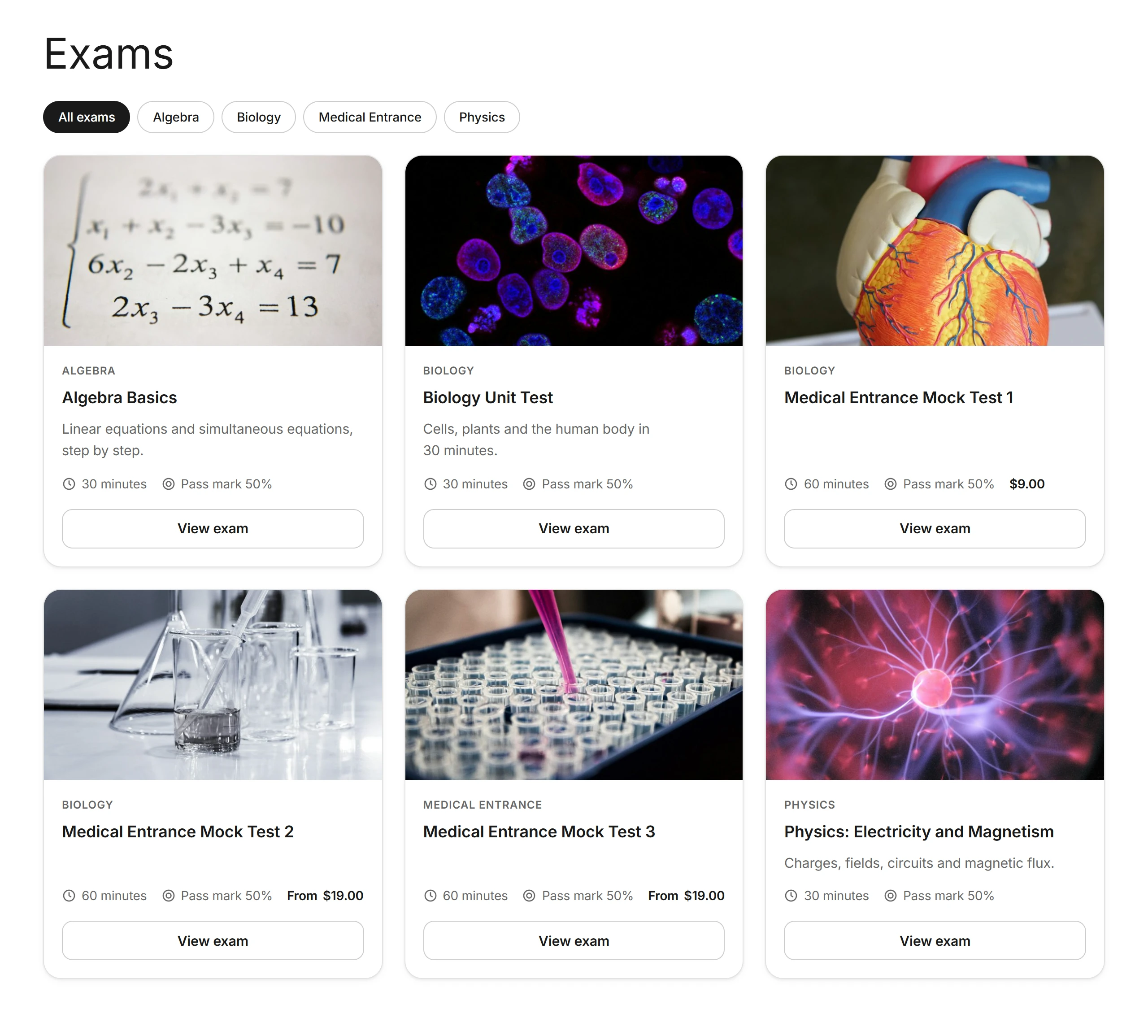
Image first PRO
Compact list PRO
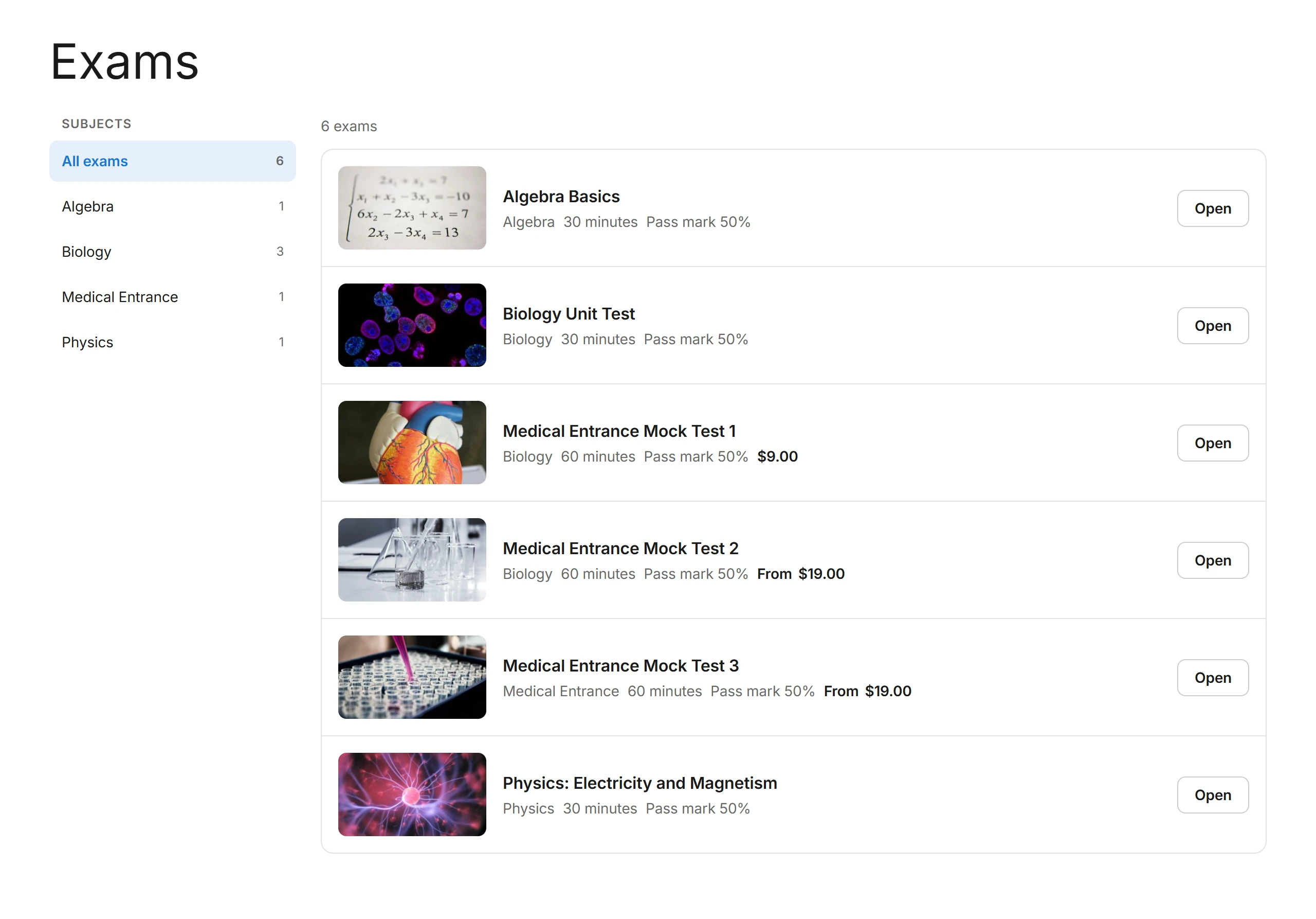
Things that work in every style
- Subject filter. When the list holds exams from two subjects or more, visitors can narrow it by subject. Each subject is a plain link (
?pxe_subject=12), so it can be bookmarked and page caches work. - Narrow spaces. Layouts follow the space they are given, not the screen. A list or exam page embedded in a narrow theme column stacks its columns, and phones get one column.
- Your colours and dark mode. Every style uses the colours from Settings › Appearance.
- Right-to-left languages such as Arabic.
My learning summary
The [plugixa_exam_dashboard] page now opens with four numbers (exams taken, passed, average score, certificates) and a Continue exam button when the learner has an exam open. Only released results count towards passed and the average. Leave it out with sections="exams,results,certificates".
For developers
- Each
.pxeroot carries a class for the style in use:pxe--style-clean,pxe--style-imageorpxe--style-compact. - Theme overrides still win over every style. Copy a file from
templates/frontend/toyourtheme/plugixa-exam/. - Add your own style with the
plugixa_exam_frontend_stylesfilter (slug => label) and serve its templates throughplugixa_exam_template_path. - The forms on an exam page are in
parts/exam-gate.phpand the error notice inparts/exam-error.php, so a layout can move them without copying them.
Quick Links
Share